| Image |
Comment |
| 09/07/2015 04:46:44 PM |
|
 Photographer found comment helpful. Photographer found comment helpful. |
| 09/06/2015 07:01:59 AM |
Exposition Everestby Ja-9Comment by sidpixel: *Hello from Sid and the Critique Club*
An interesting image that meets the challenge.
Your image is more of a normal interpretation of the challenge theme that judging by your commenters seems to have been lacking in most of the other entries. It is well executed with your model's hand positioned in the correct place to 'hold' the mountain in his hand, however, I think it would have worked better if you could have extended the DOF from his hand to the mountain and got that sharper. It would also have been a lot more convincing if he could have been looking to the mountain instead of the camera and having him out of focus would not have been a problem then. Instead of holding the mountain he could have had it between his fingers as though placing it into position within the landscape.
The image itself is a little too highly exposed although within acceptable limits it has enabled you to get a better exposure on the man himself but the mountain itself, the most important element in the image, has significant areas of blown highlights.
Anyway, thanks for your submission and apologies for the delayed critique, as they say, 'better late than never', or at least I hope it is, Sid. Please feel free to reciprocate on any of my images, I would welcome your feedback… |
| Photographer found comment helpful. |
| 09/04/2015 06:36:09 AM |
s e a • p e a r l sby Ja-9Comment by sidpixel: *Hello from Sid and the Critique Club*
An appealing image that is assumed to meet the challenge.
Haven't I already commented on this before? If not, then it is a very strikingly similar image to one already entered and critiqued by me. Yes, I've found it, 'pearls', I assume this was the outtake I saw at the time? Well, everything I said about the original applies equally to this, it has more symmetry than the pearls but as I said before I am still torn between the two.
Thanks for your great entry, Sid |
| Photographer found comment helpful. |
| 09/04/2015 12:02:57 AM |
|
| Photographer found comment helpful. |
| 09/03/2015 10:48:33 PM |
|
| Photographer found comment helpful. |
| 09/03/2015 02:21:00 PM |
|
| Photographer found comment helpful. |
| 09/01/2015 02:43:25 PM |
|
| Photographer found comment helpful. |
| 08/30/2015 07:15:18 AM |
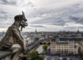
t h e • w a t c h e rby Ja-9Comment by sidpixel: *Hello from Sid and the Critique Club*
An excellent cityscape that contributes well to the open challenge
A great choice of viewpoint and title, the dominant placement of the gargoyle transforms the image from a straightforward landscape into something much more interesting, it brings it alive.
The lighting though dull is conducive to a good even exposure, there is plenty of good detail throughout. The one thing I don't like is the sharpening halo around the gargoyle which is a shame as it is such a crucial element of the image.
Apologies for the delayed critique, as they say, better late than never, Sid |
| Photographer found comment helpful. |
| 08/29/2015 01:29:31 PM |
• s w o r d p l a y • by Ja-9Comment by sidpixel: *Hello from Sid and the Critique Club*
An intriguing image that meets the challenge well.
Lovely colours against the black background it makes for a very effective abstract. I like the implied diagonal composition and the way the colours merge together with clear separate red and green sections.
I'm not really sure how you have done this, it looks like some sort of light painting with green and red lights, its the shapes that are the intriguing element, very interesting. Well done Janine.
Apologies for the delayed critique, as they say, better late than never, Sid |
| Photographer found comment helpful. |
| 08/28/2015 09:31:10 PM |
|
| Photographer found comment helpful. |
Home -
Challenges -
Community -
League -
Photos -
Cameras -
Lenses -
Learn -
Help -
Terms of Use -
Privacy -
Top ^
DPChallenge, and website content and design, Copyright © 2001-2026 Challenging Technologies, LLC.
All digital photo copyrights belong to the photographers and may not be used without permission.
Current Server Time: 06/19/2026 02:29:41 PM EDT.