| Image |
Comment |
| 09/22/2008 09:50:42 PM |
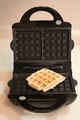
How many can you see?by pbd20032003Comment by rinac: Back to comment: The first thing that strikes me here is the lean. The camera's angle is at odds with the lines in the background, making it all look strangely drunken. On the floor? Maybe getting down to the same level rather than looking downward would have helped line everything up better. Also, could do with a bit more contrast and sharpness :) |
 Photographer found comment helpful. Photographer found comment helpful. |
| 09/22/2008 07:35:12 PM |
|
| 09/22/2008 01:43:22 PM |
|
| Photographer found comment helpful. |
| 09/22/2008 04:12:41 AM |
|
| 09/21/2008 10:59:18 PM |
|
| Photographer found comment helpful. |
| 09/15/2008 05:11:39 PM |
|
| Photographer found comment helpful. |
| 09/11/2008 09:12:55 PM |
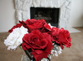
Romanticby pbd20032003Comment by Ronzilla84: The flowers are nice...but I don't like the background. It might have worked better if the fire was lit and the lights were dimmed to give it a more romantic feel. |
| Photographer found comment helpful. |
| 09/11/2008 08:41:06 PM |
Romanticby pbd20032003Comment by bassbone: The flowers are pretty, but the background is actually distracting and does not frame the flowers very well. |
| Photographer found comment helpful. |
| 09/11/2008 12:50:14 PM |
Romanticby pbd20032003Comment by JuliBoc: I think the composition would be more effective if you had stood a little to the side so that the roses were off center and not directly in front of the fireplace. Also if the fireplace is a feature in the image, it would "warm up" the romance to have a fire burning. |
| Photographer found comment helpful. |
| 09/11/2008 12:43:10 AM |
Romanticby pbd20032003Comment by rinac: Red and white roses look gorgeous together! But the image looks rushed though, almost a snapshot. Maybe if you got lower so that we could see the entire vase? Then with the out of focus fireplace in the background, we'd get more of the sense of "romantic". |
| Photographer found comment helpful. |
Home -
Challenges -
Community -
League -
Photos -
Cameras -
Lenses -
Learn -
Help -
Terms of Use -
Privacy -
Top ^
DPChallenge, and website content and design, Copyright © 2001-2026 Challenging Technologies, LLC.
All digital photo copyrights belong to the photographers and may not be used without permission.
Current Server Time: 07/16/2026 05:02:52 AM EDT.