| Image |
Comment |
| 06/14/2013 12:33:12 AM |
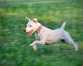
Pure Joyby dswannComment by Neat: how did you get the motion blur with 1/100 of a sec I don't get it, I can do this with 1/25? |
 Photographer found comment helpful. Photographer found comment helpful. |
| 06/14/2013 12:20:47 AM |
Pure Joyby dswannComment by SandyP: Ohmygosh! This was one of my favorites in this challenge! What a GREAT shot... and an adorable dog!
|
| Photographer found comment helpful. |
| 06/13/2013 05:45:06 PM |
Pure Joyby dswannComment by markwiley: I am a sucker for a good dog shot, and this one is superb. The perked ears and tail, the motion, nice job. |
| Photographer found comment helpful. |
| 06/11/2013 10:42:55 AM |
Pure Joyby dswannComment by Tiny: Has to be one of my top picks, fits the challenge so well. |
| Photographer found comment helpful. |
| 06/11/2013 03:47:20 AM |
|
| Photographer found comment helpful. |
| 06/11/2013 12:59:01 AM |
|
| Photographer found comment helpful. |
| 06/07/2013 08:46:41 AM |
|
| Photographer found comment helpful. |
| 06/05/2013 01:43:59 PM |
|
| Photographer found comment helpful. |
| 06/04/2013 09:18:42 AM |
|
| Photographer found comment helpful. |
| 05/31/2013 11:32:13 AM |
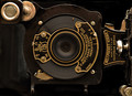
circa 1924by dswannComment by Nectar1116: Wow. What can I say. I really love this photo (my fave of the challenge). The choice to shoot it in portrait with everything rotated 90 degrees is really nice. It makes me focus on the form and geometry instead of having the type dominate the photo. I also spend more time looking at it to read the words, but I can enjoy the form of the letters too. The gold knob and text on the right are balanced really well by the gold rivet in the top left. The sheer number of round objects in the frame also helps to give a sense of patterns and balance. On top of all that, your lighting and DOF are superb. AND who on this site doesn't love a subject that is about photography.
I like to try and give a little constructive criticism in most of my comments if I think the photograph could benefit from it. I struggle to find much to say in that regard for this photo. Everything feels like it was straight out of the camera too, with little done in post (idk if this is true or not but thats how it looks) and that is a really great thing. Maybe you could have tried to tone down the brightness of the knob on the right side of the photo so it isn't so white, but even that IDK if it would make the image better without seeing it first, bc the brightness gives the knob shine and contrasts it nicely to the worn metal plate below it. So just a thought, but idk if it is even really necessary.
Great job. |
| Photographer found comment helpful. |
Home -
Challenges -
Community -
League -
Photos -
Cameras -
Lenses -
Learn -
Help -
Terms of Use -
Privacy -
Top ^
DPChallenge, and website content and design, Copyright © 2001-2026 Challenging Technologies, LLC.
All digital photo copyrights belong to the photographers and may not be used without permission.
Current Server Time: 07/26/2026 01:10:17 PM EDT.