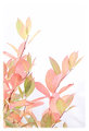
Fire Bush at fallby
michelaudetteComment by FrankRobinson: Hi! Welcome to your (very amateur!) critique.
My overall impression of this shot is that it should have done better. It is a beautiful concept, very well realised. I think that there are a couple of minor points which may have held it back.
Technically: Actually I don't really have anything to add. I suspect that your prep for the shot (with the white board) saved an awful lot of PP work.
Artistically: The colours are excellent, giving the whole a superb dreamy quality. The composition is quite strong, but I would probably have cropped the top all the way down to the top leaf - I am not sure that the white up there adds a lot. The white vignette also probably put some voters off. I can see that this might have been intended to add to the dream quality, but I am not sure it works. A hard white border might have been better.
PP: This could have been sharper, but I think you were right not to make it so. You would have lost some of that dream quality. What I would recommend is to use the freedom of advanced editing and clean up the edges - there are some odd yellow lines in the vignette which are distracting and a linear shadow bottom right which I would have dodged out - again it is distracting.
In summary, I like this. I didn't vote but would have gone for either a 6. With some of the details cleared up probably a 7. Nice one!