Glassby
TomH1000Comment by xianart: hello from the critique club
my name is christian, and i'm a memeber of the CC. if you have any questions about this critique, please pm me and i'll try to help with anything i can.
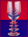
a very interesting image. techincally very good, with the receedihng lines of the glasses drawing you in. the texture and detail of the glass itself are well rendered too.
however, i find the colour on the background becomes overpowering and distracting. i think it may be the flatness and purity of the tone that works agains the image. with perhaps a bit more variation of tone in the background, it would bring the eye in to the glasses more, focus our attention. i also find the border very distracting to your image. it sets up an unpleasant dissonance, and actively draws the eye from your subject. lastly, i think the glasses could be improved by a little darker tones on some of the reflections. the midtones do tend to blur together.
so, a very nice image that, with a little work, could be outstanding. well done indeed.
if you have any qyestions about this crit, please pm me.
best wishes,
c.