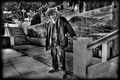
Lost In Translation.by
twotkynsComment by jaysonmc: Cheers from the Critique Club:
11th Place, wow. Not sure why you wanted a critique on this photo, it obviously struck a cord with the voters. Here goes.
What this photo has going for it:
You managed to use the frame in nearly a perfect way. Equal parts left/right and the tree branches spreading lines out. Very nicely done. The choice of B&W was good here, as these types of shots get a little too busy with color. The shot is well processed with a nice high contrast large tonal range. The various shapes also is a nice touch, circles, squares, lines, etc...
Scoring better:
Can't really add much here as anything above a 6 generally would just be nitpicking. I would think this photo would have done even better the Poverty Challenge.
Things to consider in the future:
Some things I would like to see. Maybe tone down the brights/contrast just a bit I think this might bring out the tonality better. Lastly, not sure if you thought this would do poorly? If you think a photo might do as well next time you might refrain from the critique club as it is probably less beneficial to you than others.
To Sum Up:
Personally, I think it is a wonderful photograph with a lot going for it. 6.1 is a terrific score and you should be happy. I don't really have much to offer in terms of improving the photo. The last part is more of a reflection what I like to see in a shot and is a matter of personal preference and in no way impacts this wonderful shot.