| Image |
Comment |
| 07/20/2011 03:37:51 AM |
|
 Photographer found comment helpful. Photographer found comment helpful. |
| 07/19/2011 04:55:36 PM |
|
| Photographer found comment helpful. |
| 07/18/2011 03:03:16 PM |
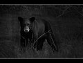
Wildlife Photography Tips: Take Better Wildlife Photosby mbrutus2009Comment by EL-ROI: Very awesome shot. I like the pose captured and the glare looking right out to the viewer puts the viewer in the scene. I think this is a bit underexposed unless you were going for a low key effect. Other than that, the only thing I could think of changing would be the use of rule of thirds. But that has no affect on the vote. |
| Photographer found comment helpful. |
| 07/18/2011 10:33:32 AM |
|
| Photographer found comment helpful. |
| 07/18/2011 09:25:34 AM |
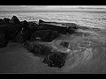
Wildlife Photography Tips: Take Better Wildlife Photosby mbrutus2009Comment by redmoon: Initially unconsidered reaction would be it’s a bit too dark but at the same time washed out without the blacks being quite bold enough. The appearance suggests to me that burning and dodging seems a bit overcooked (I’m more than guilty of doing that myself) but not enough to make the main subject of the image leap out at you. Possibly all it needs is a quick boost on the contrast? Composition is also a bit off in my mind; feels a bit inverted (not the word I’m looking for).
As a rule, I don’t let borders influence my scoring; if you buy a print you can always change the frame. However, I would imagine you’ll get a couple of negatives on this one; not widescreen enough to be cinematic, or just looks like the ends are missing.
My First Weighted Scoring System ™; composition + technical 1.5/3, challenge* 1/1, post processing results 1/2, ooooh factor 1.5/3, originality 0.5/1 =5.5, rounded to 6 (* I don’t think it’s possible to not meet the challenge on this one so everyone gets a 1/1) |
| Photographer found comment helpful. |
| 07/18/2011 07:29:52 AM |
|
| Photographer found comment helpful. |
| 07/17/2011 10:51:44 PM |
|
| Photographer found comment helpful. |
| 07/16/2011 01:15:01 PM |
|
| Photographer found comment helpful. |
| 07/13/2011 10:52:08 PM |
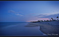
Florida Beaches by mbrutus2009Comment by Ja-9: here are my thoughts...a little less foreground bringing the buildings on the right slap dab in the lower rule of thirds. you have the colors and processing right on target for sure...this is a very pleasing picture...my only problem is that the buildings aren't a little bigger...and I think that if you bring it down to the lower thirds it will give that feel. excellent job Marko!!! and I agree with Kelli...should have left this for the rule of thirds blue challenge... |
| Photographer found comment helpful. |
| 07/13/2011 10:47:21 PM |
|
| Photographer found comment helpful. |
Home -
Challenges -
Community -
League -
Photos -
Cameras -
Lenses -
Learn -
Help -
Terms of Use -
Privacy -
Top ^
DPChallenge, and website content and design, Copyright © 2001-2026 Challenging Technologies, LLC.
All digital photo copyrights belong to the photographers and may not be used without permission.
Current Server Time: 06/26/2026 06:35:32 PM EDT.