| Image |
Comment |
| 10/24/2011 11:21:56 AM |
|
 Photographer found comment helpful. Photographer found comment helpful. |
| 10/24/2011 08:41:51 AM |
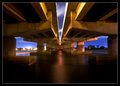
Center of Attentionby mbrutus2009Comment by markwiley: Great shot -- beautiful lines and tones. Congrats on making the top 20. The bad news for me: you edged me by 0.040 or I would have broken into the top 20. Next time please make it a tad out of focus, leave a small smudge on the lens, or maybe don't do such a nice job processing it. ;P |
| Photographer found comment helpful. |
| 10/24/2011 08:09:39 AM |
|
| Photographer found comment helpful. |
| 10/24/2011 03:40:16 AM |
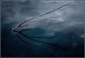
Zenby mbrutus2009Comment by tanguera: Really beautiful, Marko. No one can tell you if it will be published on 1x. You either go for it and take a chance at rejection, or don't go for it and never know if it would be published. |
| Photographer found comment helpful. |
| 10/24/2011 12:18:54 AM |
|
| Photographer found comment helpful. |
| 10/23/2011 11:59:57 PM |
Center of Attentionby mbrutus2009Comment by Jutilda: Love the silkiness of the water. Nice symmetry yet it has juxtaposition with the lights on the left and the deeper tones of shadow on the right. |
| Photographer found comment helpful. |
| 10/23/2011 02:06:38 PM |
|
| Photographer found comment helpful. |
| 10/23/2011 01:37:52 PM |
Center of Attentionby mbrutus2009Comment by Garry: Oh, this is very, very nice. Superb composition and capture. Suspect I'm staring one of the top 3 here.
PS...this bridge looks very similar to a bridge on one of the previous Symmetry challenges. |
| Photographer found comment helpful. |
| 10/21/2011 06:40:20 PM |
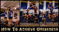
Greatnessby mbrutus2009Comment by sinistral_leo: Good Job! Marko, I am afraid people are going to score low because it appears to be 3 separate events, not steps in order, per se. |
| Photographer found comment helpful. |
| 10/21/2011 01:16:33 PM |
Greatnessby mbrutus2009Comment by EL-ROI: Great action photo's! Especially hard in the low light gym, I am sure. There are two issues, one is important, the other is an opinion. The first is the difference in white balance between the first image and the last two. The walls are pinkish due to the light, whereas the other two photo's are nice and bright white. All three shots really need to be uniform. The second is the font selection. Not too fond of it. Too much stuff going on. Would prefer a white to maintain that uniformity. |
| Photographer found comment helpful. |
Home -
Challenges -
Community -
League -
Photos -
Cameras -
Lenses -
Learn -
Help -
Terms of Use -
Privacy -
Top ^
DPChallenge, and website content and design, Copyright © 2001-2026 Challenging Technologies, LLC.
All digital photo copyrights belong to the photographers and may not be used without permission.
Current Server Time: 06/25/2026 12:49:32 PM EDT.