| Image |
Comment |
| 10/04/2009 04:07:55 PM |
|
| 10/04/2009 03:48:05 PM |
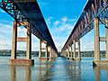
Straight to the other sideby mbish7373Comment by Yo_Spiff: Appears to have been taken through a window that gave you some reflections at the top. Not much you can do to fix that in basic editing and would still be some work in advanced. |
| 10/03/2009 11:03:14 PM |
|
| 10/03/2009 04:02:22 PM |
|
| 10/03/2009 08:35:33 AM |
Straight to the other sideby mbish7373Comment by rennie: Strange light and colours. There are some horizontal shadows in the upper part of the picture. I wonder what is it. The sky looks unreal - it's so intensely blue. Nice leading line, nice subject. Good luck. |
| 10/02/2009 11:46:18 PM |
|
| 10/02/2009 11:15:18 PM |
|
| 10/02/2009 11:10:46 PM |
Straight to the other sideby mbish7373Comment by Leo: This would have been a great image for this challenge, subject's great. But on the technical side, it looks like you shot this through a (car?) window. There's glare or reflection that goes horizontal in the upper part and some reflection splotches. You might get knock down for that. |
| 10/01/2009 10:02:56 AM |
Straight to the other sideby mbish7373Comment by fitz3000: Am I imaging it or you have taken this photo from some sort of window, these is a reflection in the upper part of the photo, kinda distracting, aniway a good shot, 7 |
| 09/26/2009 03:20:05 AM |
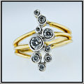
Girls prefer nine best friendsby mbish7373Comment by salmiakki: Greetings from the Critique Club
I didn't actually vote on this image (I only managed 20% in the 9 challenge) but had I done so I would likely have given it a 5/6.
I do like the subject and the composition is great. The centered composition with a square crop was certainly the best way to go with this one. The depth of field was a good choice.
For me though the lighting seems a bit flat. I think you could likely have corrected some of this in post processing. I dragged the image into Photoshop CS3 and noticed that an adjustment (using Adobe Camera Raw) in the white balance settings brightened the image up a lot, made the background whiter (without having to adjust exposure, brightness or levels) and overall the image had a bit more depth.
I also agree with Ericwoo about the border, I feel the black doesn't enhance the image at all.
Still, overall I think it was a nice idea that fell a bit flat in the execution. |
 Photographer found comment helpful. Photographer found comment helpful. |
Home -
Challenges -
Community -
League -
Photos -
Cameras -
Lenses -
Learn -
Help -
Terms of Use -
Privacy -
Top ^
DPChallenge, and website content and design, Copyright © 2001-2026 Challenging Technologies, LLC.
All digital photo copyrights belong to the photographers and may not be used without permission.
Current Server Time: 07/15/2026 04:12:35 PM EDT.