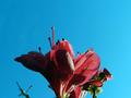
Blue skies and pretty flowers on a spring day!by
tolovemoonComment by HBunch: *Critique Club*
Funny out of the crit club shots I've done for minimalism, the comments either say that the subject is too big, or the subject is too small. Geez, make up my mind. lol
Anyway, I think this is simple enough to qualify for minimalism.
The first thing that really stands out to me is the lighting. It gets a bit dark to the left side of the flower. I'm thinking that some fil flash or some reflected light might have helped get some light on that darker area and it would contrast evenly with the nice background then.
The background is perfect. I love the blue in combination with the color of the flowers.
Focus and clarity are really good in my opinion. We get to see a lot of neat detail in the flowers.
One thing I find distracting is the little piece of branch in the lower left corner. This adds nothing to the photo at all, and without it, it would help to draw our attention to the flowers and also help increase the minimal effect.
Overall I think it's a nice shot of the flowers and it really stands out nice on that background.
~Heather~