| Image |
Comment |
| 11/09/2004 09:53:31 AM |
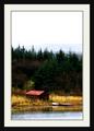
Novemberby JohannesFrankComment by doctornick: Way to much of a border. The actual picture gets too small and loses impact. That was potentially an 8 without that overwhelming border. A split neutral density filter could have helped increase the saturation in the sky while exposing the tress and house properly. |
| 11/09/2004 02:08:48 AM |
Novemberby JohannesFrankComment by colda: whoa! easy on the border!
nice image, can clearly see it as a calendar, wish that I could look at the image without the border getting distracting so much though |
| 11/09/2004 01:55:14 AM |
Novemberby JohannesFrankComment by gruvin: I like the way the negative space in the over-exposed sky anchors the earth to the water here. |
| 11/08/2004 10:47:44 PM |
Novemberby JohannesFrankComment by dipaulk: I rarely comment on a person's borders, but this one just overwhelms what could have been a beautiful photo. I would have rated it higher without the frame/border. |
| 11/08/2004 09:58:20 PM |
|
| 11/08/2004 07:03:24 PM |
Novemberby JohannesFrankComment by charmayne: great scene...the framing is a little distracting on a calender shot for me, but would look great on the wall. |
| 11/08/2004 05:21:35 AM |
Novemberby JohannesFrankComment by siggi: the frame is too heavy. realy distracts you from the image.
Usually I do -1 for a bad frame but you get -2 for the frame.
With there where some detail left in the sky but its all just washed out. |
| 11/08/2004 04:32:31 AM |
|
| 11/08/2004 02:58:07 AM |
Novemberby JohannesFrankComment by RedOak: This picture seems very interesting and nice. Unfortunatly, because of the "very big" frame, we do not see much of it. The colours look really rich, while the sky could've used some work.
As a recommendation, i would propose to remove the frame completly, and just add a little framing line, a few pixel-distance from the actual picture (black background) with a nice golden colour. This would bring out a lot more of the image.
An unwriten rule of framing: Never use the dominant or most 'foreground' colour as a frame display. Go with the soft and unique colours. (in your case, yellow, green or Red would've probably given more punch). |
| 11/08/2004 12:19:31 AM |
|
Home -
Challenges -
Community -
League -
Photos -
Cameras -
Lenses -
Learn -
Help -
Terms of Use -
Privacy -
Top ^
DPChallenge, and website content and design, Copyright © 2001-2026 Challenging Technologies, LLC.
All digital photo copyrights belong to the photographers and may not be used without permission.
Current Server Time: 04/29/2026 03:35:40 PM EDT.