| Image |
Comment |
| 04/25/2005 09:09:47 AM |
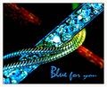
Blue for youby JohannesFrankComment by Shaman: great colours. I love the red in the background, really makes the blue pop. The only suggestions I have is to remove the overblown highlights opn the one central gem. It seems just a bit too much. Also, the DoF could have been slightly deeper, to avoid the lack of focus in the the bottom left - very nice overall - 7 |
| 04/25/2005 08:26:59 AM |
|
| 04/25/2005 02:07:05 AM |
|
| 04/25/2005 01:28:33 AM |
|
| 04/25/2005 12:58:39 AM |
|
| 04/25/2005 12:30:08 AM |
Blue for youby JohannesFrankComment by love: you will probably get blasted with the blown out color but it really works and looks like an ad...font works too..9 |
| 04/24/2005 11:07:56 PM |
|
| 04/24/2005 10:39:48 PM |
|
| 04/24/2005 08:29:05 PM |
|
| 04/24/2005 07:26:31 PM |
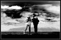
look at the photoby JohannesFrankComment by glad2badad: Ok...big sky, that's cool (and also very hip right now). ;^) The B/W works, but I think it's a tad too dark. If you were going for the dark sky maybe a different application of curves would have worked the sky without the foreground so much? Just a thought. Nice pic. |
Home -
Challenges -
Community -
League -
Photos -
Cameras -
Lenses -
Learn -
Help -
Terms of Use -
Privacy -
Top ^
DPChallenge, and website content and design, Copyright © 2001-2026 Challenging Technologies, LLC.
All digital photo copyrights belong to the photographers and may not be used without permission.
Current Server Time: 05/01/2026 07:59:49 PM EDT.