| Image |
Comment |
| 08/05/2003 12:45:19 AM |
|
 Photographer found comment helpful. Photographer found comment helpful. |
| 08/03/2003 06:02:10 AM |
Tarnished Poseby A WeaverComment by tarique: A good composition - but looks like you used the digital zoom on this one it is looking pixelated .... |
| Photographer found comment helpful. |
| 08/02/2003 09:44:45 AM |
|
| Photographer found comment helpful. |
| 08/01/2003 03:47:07 AM |
Tarnished Poseby A WeaverComment by slackm: Very good - I really like this photo! I think it would have been even better, though, with the top cropped a bit tighter to get rid of some of the white sky. |
| Photographer found comment helpful. |
| 07/31/2003 03:11:14 PM |
|
| Photographer found comment helpful. |
| 07/31/2003 09:51:29 AM |
|
| Photographer found comment helpful. |
| 07/30/2003 12:33:36 PM |
Tarnished Poseby A WeaverComment by PSUBecker: wow, the water is what caught my attention first, love the subject matter, great focus all around, good contrast behind the statue's head... would have changed the title to something else, but I give it an 8 |
| Photographer found comment helpful. |
| 07/30/2003 12:28:26 PM |
Tarnished Poseby A WeaverComment by Pidd: This is a great "in the garden" shot. I wish the lighting were just a little better on her face so that we can see more of the details of her expression since she is your focal point. However, the water in the front and the flowers in the back are great. One of the best shots I've seen yet this challenge. |
| Photographer found comment helpful. |
| 07/26/2003 08:21:34 PM |
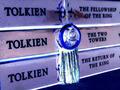
Trilogy Trendby A WeaverComment by Samara: The colors are beatifully complimented by the white glow. I like the way the bookmark dangles over the spines of the books |
| Photographer found comment helpful. |
| 07/26/2003 07:57:42 PM |
Trilogy Trendby A WeaverComment by smellyfish1002: The first thing that caught my eye here were the blues and purples. I'd say a trilogy, espeially with a cult following and movies, is definitely a trend. I like the angle of the books, rather than a straight on shot. The only thing I would have done differently would be to crop a little tighter. You have some dark blue at the top right and the bottom left corners, which is a little distracting. Also, the edges of some small details on the right side. A tighter crop would have cleaned it up a little, although a tighter crop on top would crowd the blue symbol between the words. Anyway, nice pic and post processing.
Smellyfish1002! |
| Photographer found comment helpful. |
Home -
Challenges -
Community -
League -
Photos -
Cameras -
Lenses -
Learn -
Help -
Terms of Use -
Privacy -
Top ^
DPChallenge, and website content and design, Copyright © 2001-2026 Challenging Technologies, LLC.
All digital photo copyrights belong to the photographers and may not be used without permission.
Current Server Time: 07/15/2026 07:45:20 PM EDT.