| Image |
Comment |
| 09/03/2008 11:28:32 AM |
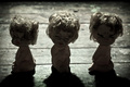
emotionsby pochvComment by Ronzilla84: A little dark for my taste...I do like the idea...I just wish I could see the faces better. I do love the crop though. |
| 09/03/2008 10:28:46 AM |
emotionsby pochvComment by GinaRothfels: I'm afraid some people won't see the detail on their monitors and that you'll get hit by 'too dark' votes. But it works for me. Really cute. |
| 09/03/2008 07:38:59 AM |
|
| 09/03/2008 07:05:59 AM |
emotionsby pochvComment by stphq: the title makes me want to see the expressions to match the emotions title but the faces are too dark to see... |
| 09/03/2008 01:46:53 AM |
|
| 08/05/2008 04:44:26 PM |
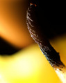
blackoutby pochvComment by karmat: CRITIQUE CLUB CRITIQUE
by karmat
Compositionally, I really like this. The colors are as much the subject as the wick, and they interact and work together nicely.
Technically, I think the focus is good, and the colors are awesome.
Overall, to me, it does convey a sense of "heat" and it is a very good abstract. I suspect, though, the sub-5 score is largely due to the fact that it is abstract, and many people may not have taken (or had) the time to really look at it and realize what it was. Also, the white area in the bottom right is very distinguishable and may have captured people's attention quickly. Since it is not in focus, that could have caused some to feel that the rest was unfocused as well.
Best to you in future challenges.
Karma |
| 07/25/2008 02:12:16 PM |
|
Home -
Challenges -
Community -
League -
Photos -
Cameras -
Lenses -
Learn -
Help -
Terms of Use -
Privacy -
Top ^
DPChallenge, and website content and design, Copyright © 2001-2026 Challenging Technologies, LLC.
All digital photo copyrights belong to the photographers and may not be used without permission.
Current Server Time: 07/15/2026 12:42:36 PM EDT.