Knockout Blow - fly!by
bcenuComment by bspurgeon: Critique Club
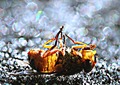
I found this to be interesting take on the challenge.
Composition: Somewhat stagnant, but the center composition works to express the nature of death. Nice placement in the lower third to meet the challenge and demonstrate bokeh
You met the challenge, but the bokeh is quite harsh, and is often most effective, when pleasant. However, the harsh nature of the bokeh complements your subject.
What I don't like about this image, and it may reflect many voters, is the harsh color/processing. I can't comment further without knowing the details, but it looks like a color negative. I believe that this also negated the focal point and softened the fly.
I think your method of presentation kept the score low, but I'm quite impressed with the uniformity of the image in conveying death. You did that quite well, and probably had no chance at a high finish! ;) Take a look at the top end of the challenge and you will see creamy smooth bokeh with pleasant colors. That's what your fly was compared to in the context of the challenge. I scored this a 5 during voting for all the reasons stated above.
Thanks for your submission to the Critique Club.
Cheers and Happy Holidays!
-BS