| Image |
Comment |
| 01/28/2003 01:16:45 AM |
|
| 01/27/2003 09:06:41 PM |
|
| 01/27/2003 07:13:54 PM |
|
| 01/27/2003 12:59:05 PM |
|
 Photographer found comment helpful. Photographer found comment helpful. |
| 01/27/2003 12:30:45 PM |
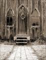
Garden Churchby ShiiizzzamComment by FranziskaLang: challenge met. nice tonal range in this photo, and duotone is a good choice for this old wooden church. i like all the textures. the symmetry is a good choice, also. the only nitpick i have is that the picture may need rotating just a tad (CCW). i would also considering cropping a bit more off the bottom. leave some of the path, just not as much. just a thought. good entry :) |
| Photographer found comment helpful. |
| 01/27/2003 02:29:57 AM |
|
| Photographer found comment helpful. |
| 01/27/2003 12:34:06 AM |
Garden Churchby ShiiizzzamComment by crabappl3: I took me a minute to see that this is not crooked. Your step and path are level, it's the church that is crooked. You're color work is excellent and by leaving a long path to it, we are left to wonder who else has walked down this path in the years past. Great shot. |
| Photographer found comment helpful. |
| 01/22/2003 08:30:10 AM |
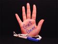
Redneck Palm Pilotby ShiiizzzamComment by goodtempo: Critique Club critique:
Composition/Content: Very funny image. The simplicity gives the image it's impact. It's also funny that a redneck would have to write down such a note. I think the rectangle works great being a natural photo shape, it helps the subject stand out and be the center of attention. The angle of the writing also brings the eye straight to the message. Using a woman's hand makes it even funnier. The ribbon adds to the picture in that is represents to me that this redneck doesn't want to lose the pen either. Nice shot.
Lighting: Good lighting.
Background: Good choice in background as it accentuates the subject.
Camera Work/Technical: Good exposure. The soft focus could have been a little sharper but doesn't distract from the image very much.
Digital Processing: The image could benefit from some jpeg artifact removal. It would also make the reddish shadows look better.
My Opinion: This image could easily be a commercial for a beer company. Very creative and well done.
|
| Photographer found comment helpful. |
| 01/20/2003 01:32:30 AM |
|
| 01/19/2003 11:52:50 PM |
|
Home -
Challenges -
Community -
League -
Photos -
Cameras -
Lenses -
Learn -
Help -
Terms of Use -
Privacy -
Top ^
DPChallenge, and website content and design, Copyright © 2001-2026 Challenging Technologies, LLC.
All digital photo copyrights belong to the photographers and may not be used without permission.
Current Server Time: 06/13/2026 02:06:30 AM EDT.