| Image |
Comment |
| 04/13/2008 10:19:07 PM |
|
 Photographer found comment helpful. Photographer found comment helpful. |
| 04/13/2008 07:43:35 PM |
|
| Photographer found comment helpful. |
| 04/11/2008 10:58:52 PM |
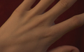
Handby ScooterMcNuttyComment by Love6: I rated this image a 5... I like the idea of it, and some of its composition, the thumb peeking up out of the bottom of the frame seems rather...alone? when i ignore that the symmetrical lines of the hand are beautiful- i wish they were lit a bit more so i could see it though? - I do like the background choice (black) - perhaps desaturation would have helped with this image (B&W?) my eyes drift off the left edge ofthe frame because of the nice lines you captured in the hands layout- perhaps a frame would help prevent that? I do like the image, but there are a few thing sI think might have made it really pop ? I hope my suggestions are helpful - i'm not an expert tho- :) I hope your image does well! :) |
| Photographer found comment helpful. |
| 04/11/2008 11:46:11 AM |
Appleby ScooterMcNuttyComment by scruff: Good focus. Sometimes a seperate light for the background helps to differentiate the subject a little more. |
| Photographer found comment helpful. |
| 04/10/2008 07:10:58 PM |
|
| Photographer found comment helpful. |
| 04/10/2008 07:10:04 PM |
Handby ScooterMcNuttyComment by Jason_Cross: I think just a bit more contrast would have brought up the character of the hand. I like IE framed it however. |
| Photographer found comment helpful. |
| 04/09/2008 11:52:18 PM |
|
| Photographer found comment helpful. |
| 04/09/2008 11:00:02 AM |
Appleby ScooterMcNuttyComment by jeger: The shadow at the bottom of the photograph is a little distracting. Photo could be a little brighter overall. |
| Photographer found comment helpful. |
| 04/07/2008 06:43:23 PM |
Handby ScooterMcNuttyComment by rinac: Good idea, but the lighting could have been better to bring out more of the lines and texture in the skin. |
| Photographer found comment helpful. |
| 04/06/2008 09:49:48 AM |
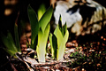
Beggining of Springby ScooterMcNuttyComment by MaryO: The contrast between the new leaves and last year's withered ones is nice. The light seems a bit harsh for a spring shot (I tend to think of spring as a soft season), and what appears to be a heavily shadowed rock in the back looks almost foreboding, which again detracts from the new life sort of feeling I expect from this kind of shot. |
| Photographer found comment helpful. |
Home -
Challenges -
Community -
League -
Photos -
Cameras -
Lenses -
Learn -
Help -
Terms of Use -
Privacy -
Top ^
DPChallenge, and website content and design, Copyright © 2001-2026 Challenging Technologies, LLC.
All digital photo copyrights belong to the photographers and may not be used without permission.
Current Server Time: 06/18/2026 02:06:18 PM EDT.