| Image |
Comment |
| 06/15/2008 01:36:59 AM |
|
 Photographer found comment helpful. Photographer found comment helpful. |
| 06/15/2008 01:35:04 AM |
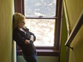
mk15small.jpgby zackdezonComment by egamble: Her hand is positioned strangely. I still really like it. Great job again. Message edited by author 2008-06-15 01:36:04. |
| Photographer found comment helpful. |
| 06/15/2008 01:33:20 AM |
|
| Photographer found comment helpful. |
| 06/15/2008 01:31:54 AM |
mk5small.jpgby zackdezonComment by egamble: This one is fantastic. Would be 'magazine' like if the left side of her face didn't have a shadow. (better than anything I have ever done)
Great job |
| Photographer found comment helpful. |
| 06/15/2008 01:30:33 AM |
mk4small.jpgby zackdezonComment by egamble: she is cute....
I think the background might have too much going on. if it were blurred out this would be one of my fav's of the session.
it is still good. |
| Photographer found comment helpful. |
| 06/15/2008 01:00:54 AM |
mk21small.jpgby zackdezonComment by Sugarpie: I like this picture, it makes it seem like she is laughing at something someone on the other side of the doorway said |
| Photographer found comment helpful. |
| 06/15/2008 12:45:36 AM |
|
| Photographer found comment helpful. |
| 06/15/2008 12:44:42 AM |
|
| Photographer found comment helpful. |
| 06/15/2008 12:43:07 AM |
mk3small.jpgby zackdezonComment by smurfguy: Nice shot! Careful not to blow the highlights on her face. If you use CS3, try shadow/highlight tool... or selective color adjustment layer, select "whites" and turn up the black a touch. Message edited by author 2008-06-15 00:43:18. |
| Photographer found comment helpful. |
| 06/14/2008 11:21:34 AM |
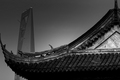
Something Old...by zackdezonComment by karmat: CRITIQUE CLUB CRITIQUE
by karmat
First off, I love the tight composition of this. While the tower thingy in the background is a bit distracting, in one sense (and it would make a really cool picture without at), in another sense, it adds to the shot by contrasting old/traditional with more modern.
Technically, the focus, exposure, etc. is good. I think the biggest thing noticeable to me is that it seems to be gray overall. It needs some more distinct white/light areas, I think. Admittedly, I am not sure how or where, unless in the conversion process you could get the whitish area on the right a bit brighter.
Overall, a nice shot. It is very graphic and clean.
Best to you in future challenges.
Karama |
| Photographer found comment helpful. |
Home -
Challenges -
Community -
League -
Photos -
Cameras -
Lenses -
Learn -
Help -
Terms of Use -
Privacy -
Top ^
DPChallenge, and website content and design, Copyright © 2001-2026 Challenging Technologies, LLC.
All digital photo copyrights belong to the photographers and may not be used without permission.
Current Server Time: 07/26/2026 11:00:15 PM EDT.