| Image |
Comment |
| 04/03/2009 10:09:26 PM |
|
 Photographer found comment helpful. Photographer found comment helpful. |
| 04/01/2009 08:12:12 AM |
|
| Photographer found comment helpful. |
| 03/31/2009 08:00:06 AM |
Fallin'by zackdezonComment by limerick: Thanks for the comment on mine. The only thing I would have done different on yours is use color balance to the cool side (or use suggested settings) and then desaturated the reds a little so it didnt look like the blood was rushing to your head. hahah. But I think its very good and I havent seen it before you sent it in your comment to me.
Where did you take it so I can go and search for some of the change? :=) |
| Photographer found comment helpful. |
| 03/30/2009 06:19:30 PM |
|
| Photographer found comment helpful. |
| 03/30/2009 03:07:27 PM |
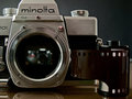
Forgottenby zackdezonComment by spiritualspatula: Hello from the Critique Club-
First things first: Your entry meets the challenge quite well. One thing I definitely like about this photo is that it is more than it initially appears. At first glance, one simply sees the Minolta, but a closer inspection reveals the Nikon peering out of its depths. As others have said, I like this contrast between the new and old, especially considering your title, which brings the transition from film to digital into the spotlight. I think your lighting is pretty good too. I’m not too sure of how you portrayed the film, however. If this wasn’t such a close crop, I would consider pulling the film out some and having it laid out. To me, the placement you went with sorta makes it fight with the camera as the focal point for the viewer. On the other hand, it does help the rest of your composition, and adds another element and depth (in more than one sense) to your photo, so I guess I’m on the fence about that.
Overall, I think you did a great job capturing this, and while multiple other users utilized the same subject matter, you did a good job separating yourself from the pack. One other minor comment: I would have cleaned the smudge on the Minolta letters, if at all possible (which might not be the case). If the body were more used and beaten up, I would leave it because it adds character, but since it is the only real blemish on the body, it’s a bit distracting to me.
-Derek |
| Photographer found comment helpful. |
| 03/29/2009 04:41:48 PM |
Quick Panby zackdezonComment by PennyStreet: I don't see how this can be called an abstract. There is blur and motion and the picture is good, but to me there is too much going on that's recognizable. |
| Photographer found comment helpful. |
| 03/29/2009 01:53:43 PM |
|
| Photographer found comment helpful. |
| 03/28/2009 11:55:30 PM |
|
| Photographer found comment helpful. |
| 03/28/2009 03:45:23 PM |
|
| Photographer found comment helpful. |
| 03/27/2009 06:57:19 PM |
|
| Photographer found comment helpful. |
Home -
Challenges -
Community -
League -
Photos -
Cameras -
Lenses -
Learn -
Help -
Terms of Use -
Privacy -
Top ^
DPChallenge, and website content and design, Copyright © 2001-2026 Challenging Technologies, LLC.
All digital photo copyrights belong to the photographers and may not be used without permission.
Current Server Time: 07/26/2026 03:39:11 PM EDT.