| Image |
Comment |
| 05/08/2008 08:03:34 PM |
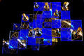
"Queen to King's Level Three"by swordandsigilComment by karmat: CRITIQUE CLUB CRITIQUE
by karmat
I really like the blue and gold on this -- it is very striking. I also think that the way that it fills up the frame works well to.
However, I think a different perspective would have made this more dramatic. It is hard to get a good grasp of the 3D nature of this, and since that is one of the things you wanted, you may have been better served shooting from lower and showing the different "levels." As it is, it all kinda muddles together.
You did well in turning the light flares/hotspots into a star shape. That adds some drama to the shot, instead of being distracting.
Nice shot, and an interesting looking game.
karma |
| 05/08/2008 04:07:36 PM |
|
| 05/07/2008 08:29:19 PM |
|
| 05/06/2008 11:56:14 PM |
|
| 05/06/2008 10:30:32 AM |
|
| 05/06/2008 04:43:41 AM |
|
| 05/04/2008 02:53:52 PM |
"Queen to King's Level Three"by swordandsigilComment by colorcarnival: If I had not seen one of these before, I probably would not totally get what I am looking at and how it is stacked because the levels are kind of blending together. This does look cool tho. Love the geometry and the blue. |
| 05/04/2008 09:27:42 AM |
|
| 05/03/2008 12:17:09 PM |
|
| 05/01/2008 09:27:10 PM |
|
Home -
Challenges -
Community -
League -
Photos -
Cameras -
Lenses -
Learn -
Help -
Terms of Use -
Privacy -
Top ^
DPChallenge, and website content and design, Copyright © 2001-2026 Challenging Technologies, LLC.
All digital photo copyrights belong to the photographers and may not be used without permission.
Current Server Time: 05/07/2026 02:07:57 AM EDT.