| Image |
Comment |
| 07/27/2005 01:32:00 PM |
|
 Photographer found comment helpful. Photographer found comment helpful. |
| 07/27/2005 01:22:42 PM |
Rhythm Makerby BlinksComment by tate: 9
clarity/contrast/color: 2/2
composition,POV,DOF: 1/2
effort+originality: 2/2
theme appropriate: 2/2
aesthetic timelessness+emotion: 2/2 |
| Photographer found comment helpful. |
| 07/27/2005 11:24:41 AM |
|
| Photographer found comment helpful. |
| 07/27/2005 09:11:37 AM |
|
| Photographer found comment helpful. |
| 07/27/2005 08:22:32 AM |
|
| Photographer found comment helpful. |
| 07/26/2005 02:33:16 AM |
|
| Photographer found comment helpful. |
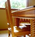
| 07/25/2005 10:46:17 PM |
Please...Sitby BlinksComment by chele: this is a fairly well taken photo and fits the challenge wonderfully. it's just sort of plain and the light from the window is a little harsh. |
| Photographer found comment helpful. |
| 07/25/2005 06:32:12 PM |
Please...Sitby BlinksComment by tolovemoon: NIce texture there a little blown out on the highlights but its a good perpespective with the light through the window, would obviouse make highlights bright.. . |
| Photographer found comment helpful. |
| 07/25/2005 02:05:35 PM |
|
| Photographer found comment helpful. |
| 07/25/2005 02:02:36 PM |
Please...Sitby BlinksComment by _Io_: The chair is too tighlty cropped at the top - it is better to show it all than lose only a tiny part of it to the edge. Quite a bright day - the highlights are excessive - there are two points of glare on the seat, and two on the rear. Shooting on a cloudier day, or at a different time of day so the sunlight isn't so harsh would help. There is a lot of detail in here, but I would have preferred a deeper DoF - the rear table leg also deserves to be in focus.
Nice use of the table to provide great leading linse, but they don't lead to anything! Maybe If you rotated the chair clockwise, so we could see the detail on the front rather than the side, it would help. Another minor distraction is the top of the far char intersecting with the window frame - it's only a minor element, bit the white line it produces could have been avoided. |
| Photographer found comment helpful. |
Home -
Challenges -
Community -
League -
Photos -
Cameras -
Lenses -
Learn -
Help -
Terms of Use -
Privacy -
Top ^
DPChallenge, and website content and design, Copyright © 2001-2026 Challenging Technologies, LLC.
All digital photo copyrights belong to the photographers and may not be used without permission.
Current Server Time: 07/15/2026 03:47:42 PM EDT.