Ace Sinsby
BlinksComment by CEJ: Hello from the Critique Club!
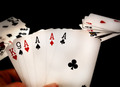
I have studied your image and have the following to offer:
Composition/perspective - the relative perspective - closeness to the hand - is good. The main cards are very centered - only slightly to the left. This may have been offset if the two hands in the background were placed more at a 10 and 2 clock position instead of the apparent 9/3 clock position or if perhaps a slightly different angle - more from left to right - to the cards in hand was presented. Moving the background cards would also help the dead space at the top. There really is no reason for it in this image and it detracts from the subject a bit as it keeps you looking at the background hands a bit longer than necessary to just grasp the aces on the table. The focus is good on the cards in hand, however, the hand itself, which is on the same plane, is not focused except for the tip of the thumb. The processing seems a bit overdone here. I see variation in the white on the face of the cards that is not present in reality. Around the numbers seems to glow a bit while the rest of the surface seems almost hit by shadow. The cards in the background don't appear to be fuzzy due to Dof, but fuzzy due to overprocessing and the same variations in white show up there as well.
Color - most of the colors in this image are well presented. However, the skin tones seem quite red and dark while the surrounding cards are well lit and light.
Lighting - hard to tell with the processing on this image. Looking at the cards in the background, the cards on the right are evenly lit/processed while the cards on the left are dark half way through the spread. The two sides appear in conflict with each other - one is dark and the other light while both are at the same relative depth. Also, again it appears to be processing, but the areas that are of main focus show signs of irregular shading. This processing appears to have taken away from the lighting used.
Challenge requirements - it meets the challenge for the topic. I think though that the subject matter is where it fell short in the voting. The same theme was done many times and voters probably got tired of seeing the same shot over and over.
Overall/my opinion - a well shot photo that got lost in the processing. The uneven 'apparent' lighting on the cards is somewhat distracting. Placement of the various elements could have been spread out a bit more to make the shot more well rounded and even in content over the whole image.