| Image |
Comment |
| 11/17/2003 11:09:05 AM |
Blood is Thicker Then Waterby Firstrich1Comment by moodville: Interesting idea and I like the fact the 'blood' is at the bottom of the glass. What appears to me as ruffles near the hand also adds a nice period mood to the image, something straight out of interview with the vampire or similar. Hrm, the thing that is distracting that I realise you had no control over without editing is the reflections on the glass. I've found that glass is an amazingly annoying thing to shoot. I think the shadow of the arm detracts from the glass, and other than playing around with the lighting, which probably would have caused more glass reflections, I'm not sure what else you could have done. Also the background is a little odd. I cant tell if you oversaturated it with an editing program or what, it certainly looks like what happens when you do that. For a dark mood the white seem out of place and a bit glaring. It that was the result of your light source then you probably needed to rearrange your lighting. Technically it has some flaws, but I do like the mood that comes across with the image. |
 Photographer found comment helpful. Photographer found comment helpful. |
| 11/17/2003 10:13:25 AM |
|
| Photographer found comment helpful. |
| 11/17/2003 09:18:46 AM |
Blood is Thicker Then Waterby Firstrich1Comment by ScantyNebula: Nice work. Colors are nice, focus, composition and lighting great.
I am not too fond of the background, it seems a bit pixelated or oversaturated - but not to the point of making this unattractive photo, because I think its a great shot. |
| Photographer found comment helpful. |
| 11/17/2003 01:48:34 AM |
Blood is Thicker Then Waterby Firstrich1Comment by Natator: Very cleverly done and great interpretation of the challenge. I find the white area middle right a little distracting, but that is a very minor critism. Nice work. |
| Photographer found comment helpful. |
| 11/16/2003 11:44:02 PM |
|
| Photographer found comment helpful. |
| 11/16/2003 11:16:54 PM |
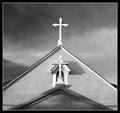
San Filipe de Neriby Firstrich1Comment by Neuferland: This looks almost like another shot in this challenge, only a different eve under the roof and a different statue on the lower roof, LOL!
I like this one very much, the contrast is a bit soft to me and the shadows on the bottom room are a bit distracting to me. I like the shadows created but the heavy black border is a bit too much, if it was a little lighter. The cropping is very well done. Started at a 6 but am going to an 8 |
| Photographer found comment helpful. |
| 11/15/2003 01:35:11 PM |
San Filipe de Neriby Firstrich1Comment by Spork99: The B&W and the symmetric composition are wonderful here. I am also enjoying the repetition of the cross shape while they contrast their styles |
| Photographer found comment helpful. |
| 11/15/2003 05:36:30 AM |
San Filipe de Neriby Firstrich1Comment by LindaLee: Great architectural shot! Love the black and white; this almost looks like a drawing or painting as opposed to a photograph. This shot is very visually appealing, and moves the eyes fluidly throughout the photo. The lights and darks are all balanced well with a wonderfully dynamic composition. The longer I look at it, the more I like it. I sure hope people take the time to really look at this, it is terrific. |
| Photographer found comment helpful. |
| 11/14/2003 10:38:18 PM |
San Filipe de Neriby Firstrich1Comment by albright1: Is this in Albuquerque??? This reminds me of the old (very old) Catholic church down by Tiguex park.
What an awesome photo... That sky looks incredible in this b/w format. Your use of symmetry is really powerful. I can't wait until the challenge ends so I can see where this was taken! |
| Photographer found comment helpful. |
| 11/14/2003 03:11:52 PM |
San Filipe de Neriby Firstrich1Comment by e301: Wonderful work - same guy as the Grado shot, I'd guess? and not just from the Italian title ... True sense of shape and tonal contrast here. Beautiful, beautiful work. Might be little too complicated an image to rate a ribbon on dpc, in the sense of it's almost abstract quality, it's concentration on the formal, but I do hope not.
Returning: seems to lack a little sharpness, though that might only be to avoid jagged edges. |
| Photographer found comment helpful. |
Home -
Challenges -
Community -
League -
Photos -
Cameras -
Lenses -
Learn -
Help -
Terms of Use -
Privacy -
Top ^
DPChallenge, and website content and design, Copyright © 2001-2026 Challenging Technologies, LLC.
All digital photo copyrights belong to the photographers and may not be used without permission.
Current Server Time: 07/19/2026 02:26:35 AM EDT.