| Image |
Comment |
| 02/24/2008 07:15:46 PM |
|
| 02/23/2008 03:42:20 PM |
|
| 02/23/2008 10:05:06 AM |
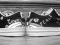
Peace and Love All-Star Styleby Kel27Comment by boyd2000: My first thought was I would have liked to see the shoes more symmetrical between the halves, but with the writing spaced differently the words are symmetrical. You should have used the full 640 pixels. The horizon appears to be slightly tilted based on the line near the top. The focus is a little soft. Maybe the title could have been "Love and Peace All-Star Style" to match the flow from left to right. |
| 02/22/2008 09:07:00 AM |
|
| 02/21/2008 09:19:09 AM |
|
| 02/20/2008 11:01:03 PM |
Peace and Love All-Star Styleby Kel27Comment by wheeledd: Nice idea! I'd like to see it done with a better setup of the shoes. I find the stair edge distracting. I also suspect that color would be better to show off the designs on the shoes. |
| 02/20/2008 10:43:19 PM |
|
| 02/19/2008 09:49:17 PM |
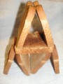
Bread Towerby Kel27Comment by trevytrev: seems a bit oof and the lighting seems a bit harsh, maybe bouncing the flash could help eliminate the harsh shadows. |
| 02/19/2008 09:23:33 AM |
Bread Towerby Kel27Comment by TygerPawz: Pretty neat creation. However, the photograph could use some help. DOF needs to be a bit more and the pieces on top have some blown out spots, probably from the flash. |
| 02/18/2008 09:34:20 PM |
Bread Towerby Kel27Comment by Jason_Cross: The lighting on this is a little off. I also think it could a benefited from a different angle. Also when you use your editing software adjusting the contrast might help to draw out some of the detail in the bread and give the appearance of a sharper image. |
Home -
Challenges -
Community -
League -
Photos -
Cameras -
Lenses -
Learn -
Help -
Terms of Use -
Privacy -
Top ^
DPChallenge, and website content and design, Copyright © 2001-2026 Challenging Technologies, LLC.
All digital photo copyrights belong to the photographers and may not be used without permission.
Current Server Time: 07/16/2026 04:57:07 PM EDT.