| Image |
Comment |
| 08/01/2010 11:40:56 PM |
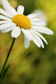
Daisy Daysby reneekerrComment by eschelar: Interesting. The effect on the background looks like the bg was moving in a line. Almost like someone was moving it, rather than wind. I don't think that was an intended effect, but it gave me a good idea and I'm going to try it!
Nice. |
 Photographer found comment helpful. Photographer found comment helpful. |
| 07/28/2010 03:17:56 PM |
|
| Photographer found comment helpful. |
| 07/16/2010 02:17:55 PM |
|
| Photographer found comment helpful. |
| 07/04/2010 04:21:12 PM |
|
| Photographer found comment helpful. |
| 07/03/2010 09:45:50 PM |
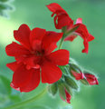
June Flowersby reneekerrComment by bassbone: i like the composition and how the reds reach out in all directions but the details seem to be missing in the image as if the focus isn't quite on the money |
| Photographer found comment helpful. |
| 07/02/2010 10:18:56 AM |
June Flowersby reneekerrComment by giantmike: I like the perspective used here. It feels like the red saturation is a bit high, giving it a neon feel. |
| Photographer found comment helpful. |
| 07/01/2010 12:09:08 AM |
June Flowersby reneekerrComment by Yo_Spiff: This seems soft and unclear. I can see visible compression artifacts around some of the edges of the petals. Your file size of only 62k indicates a highly compressed image and that is what is robbing most of the detail and sharpness from this image. Check your compression settings when you save your file. Always adjust JPEG compression so that your file size is as large as possible, but within the challenge limit.
Aside from my anal fixation with jpeg compression, this is pretty well done. I like the creamy background and the way the buds are peeking out from behind the open flower. |
| Photographer found comment helpful. |
| 06/28/2010 11:22:18 AM |
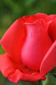
Beauty is in the eye by reneekerrComment by mycelium: Nothing wrong with a flower in what is essentially a free study. But flowers are so heavily photographed that you really have to work hard to make it stand out. The soft focus is okay, but the shape of the petals is weird and creates a claustrophobic composition. The lighting seems flat; you are large areas of almost-monotone red. The single drop of water, especially in the context of this challenge, reads like a tear, which seems arbitrary, given your title. Remember... lighting is the key! |
| Photographer found comment helpful. |
| 06/27/2010 10:44:10 PM |
|
| Photographer found comment helpful. |
| 06/27/2010 09:37:21 AM |
Journey in timeby reneekerrComment by menele: I think I get what you were trying to do with the blur of the turning pages, but the lack of focus for the whole image spoils the effect. |
| Photographer found comment helpful. |
Home -
Challenges -
Community -
League -
Photos -
Cameras -
Lenses -
Learn -
Help -
Terms of Use -
Privacy -
Top ^
DPChallenge, and website content and design, Copyright © 2001-2026 Challenging Technologies, LLC.
All digital photo copyrights belong to the photographers and may not be used without permission.
Current Server Time: 07/16/2026 05:56:49 PM EDT.