| Image |
Comment |
| 06/29/2009 05:04:52 PM |
|
 Photographer found comment helpful. Photographer found comment helpful. |
| 06/22/2009 03:02:27 AM |
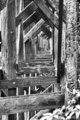
On and Onby XMountaineerComment by Leo: I like this shot. For myself, its not boring. I like the patterns, lines, and angles. I rather like these "abstract" type shots.
It's interesting reading the comments on all of these submissions. I started from the last place finisher and now I'm up to yours; what one viewer sees as a negative, another viewer sees as a positive. For what its worth, I like this photo and actually gave it a 7; then again it suits my personal tastes. (And I thought the technical aspects were fine.)
Have a good day. |
| Photographer found comment helpful. |
| 06/21/2009 11:41:28 PM |
|
| Photographer found comment helpful. |
| 06/16/2009 09:36:37 PM |
|
| Photographer found comment helpful. |
| 06/16/2009 07:58:21 PM |
On and Onby XMountaineerComment by Ja-9: I am not sure so please do not hold me to this...but I thought we were supposed to convert to B&W then add tone/color back in splitting it with 2 colors thus creating a duotone??? To me your shot is pure B&W no other tones (or at least I don't see them) This is such a wonderful shot too...excellent editing and focus...well done |
| 05/31/2009 11:31:00 PM |
Ford Taurusby XMountaineerComment by kaiser_chief: The ront of the car really needed some additional dispersed light as it is too dark and the details can't be seen. Great composition though of the overall image. |
| Photographer found comment helpful. |
| 05/31/2009 05:54:16 PM |
Ford Taurusby XMountaineerComment by neophyte: I like the selective desat to isolate the product. Text needs a different font and or size (bigger) to have more impact. Comp works well. |
| Photographer found comment helpful. |
| 05/30/2009 10:53:48 AM |
Ford Taurusby XMountaineerComment by HeiSch: Based on this photo: would you want to buy a Ford Taurus? You talk about Luxury, Style but yet you show us a garage. |
| 05/29/2009 09:01:49 PM |
Ford Taurusby XMountaineerComment by Covert_Oddity: This is an interesting location you've shot this one it, in some way's it's a lot better than all the sunset / forest type ones so far. I also like the composition, this feels a lot like the closing shot you see in a TV add where they put all the small print along the bottom!
The text is good, it is small, out of the way but still readable, you've made the ad all about the car, which is exactly how it should be.
Unfortunately I think this one's let down in a big way by the exposure / lighting. The lower left hand side of the car and a large part of the front are in darkness. This is the area that defines the look of a lot of cars and distinguishes them from all the others, so you really want this part to be properly exposed.
I'm going to give this a 7, just because of all the aspects I like about it, I would probably have made it a 9 or 10 if it wasn't for the darkness along the front. |
| Photographer found comment helpful. |
| 05/28/2009 11:15:11 PM |
|
| Photographer found comment helpful. |
Home -
Challenges -
Community -
League -
Photos -
Cameras -
Lenses -
Learn -
Help -
Terms of Use -
Privacy -
Top ^
DPChallenge, and website content and design, Copyright © 2001-2026 Challenging Technologies, LLC.
All digital photo copyrights belong to the photographers and may not be used without permission.
Current Server Time: 07/16/2026 06:17:18 AM EDT.