| Image |
Comment |
| 02/24/2005 12:33:43 PM |
Windermere Jettyby ImagineerComment by orussell: Very pretty Jon. You should be giving classes. Heck Drew and Langdon should be paying you to do tutorials. I have to say you are one of the best here.
Cheers,
Owen |
 Photographer found comment helpful. Photographer found comment helpful. |
| 02/24/2005 12:18:17 PM |
|
| Photographer found comment helpful. |
| 02/24/2005 12:07:51 PM |
|
| Photographer found comment helpful. |
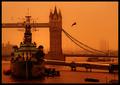
| 02/23/2005 10:10:30 PM |
Gull Above the Gunsby ImagineerComment by graphicfunk: Fron the critique club:
A very impressive image because the ship occupies the bulk of the balance and major attention. The coloration leans towards a monochromatic rendition with certain bands of colors missing. This has a dual effect of creating a strong impression, however, upon further study one detects an interference with the natural tones. Yet, while there is a touch of noise, the general effect will be loved by some and dismissed by others.
Its major strenght lies in the superb composition. A painter would have placed that bird right there. Note how it leads the eyes back in the left. The bulk of the ship creates a ballast to nail the viewer's main reference. The eyes then can roam but always return to this safe spot. An image with strong verticals brought to prominence by the sweep of the bridges cables on the left, then the bird, then the dock.
I have just observed the original. This explains the rendering and the why of the coloration. Personally, I would have prefered the sepia rendition because the composition is strong enough.
It is the glorious glow that wins over the viewer and then the composition begins to reveal its strength. The image has charm and some will accept the effect because it is unusual and a very good mood setter because of its monochromatic feel which awakens the nostalgia of the old tin plates. Others may find the tonal range too contrictive much like images which concentrate on certain zonal values at the expense of others. As is it has an aged look much like images which begin the fading process. This in itself is appealing. |
| Photographer found comment helpful. |
| 02/23/2005 09:58:52 AM |
|
| 02/23/2005 04:41:53 AM |
|
| Photographer found comment helpful. |
| 02/23/2005 12:33:22 AM |
Gull Above the Gunsby ImagineerComment by Arancha: I loved this picture from the first momment I saw it, it was my favorite and I gave it a ten right away. Not only because of the great composition, the old postcard look ... it should have finished among the top ten in this challenge. |
| Photographer found comment helpful. |
| 02/23/2005 12:09:00 AM |
~ The Last Breath ~by ImagineerComment by graphicfunk: First: this is a great image and I feel terrible about that time thing. Ay one time I did a shot and there it was for unknown reason it was in am instead of pm. Lucky I was uable to reset and reshoot.
Anyway, in my first pass I used place holder 7 for this lovely image and then I wondered where it went.
Now, my friend, there is a lot of talent in you. The fact that you are so critical with your presentations makes you a good candidate to express your art even bending the medium of photography to suit your will. You run away from these images yet realizing there is no other way to do them. Yes, I can understand the attitude towards the digital composite, but when you do an effect in the camera, you are the artist of that creation. All artwork is controlled by the artist. So you see, you are an artist but you don't want to admit to it. Remember, you can practice both styles. Look at Dali, and Picaso. They both knew how to paint in the traditional manner and in the modern. I beg you to reconsider and do bring out those images and concepts that are made of dreams. I know, there is a lot of work in you. |
| Photographer found comment helpful. |
| 02/22/2005 09:37:50 PM |
|
| Photographer found comment helpful. |
| 02/22/2005 08:00:54 PM |
|
| Photographer found comment helpful. |
Home -
Challenges -
Community -
League -
Photos -
Cameras -
Lenses -
Learn -
Help -
Terms of Use -
Privacy -
Top ^
DPChallenge, and website content and design, Copyright © 2001-2026 Challenging Technologies, LLC.
All digital photo copyrights belong to the photographers and may not be used without permission.
Current Server Time: 07/23/2026 09:08:11 PM EDT.