|
|
| Image |
Comment |
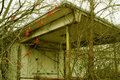
| 01/25/2008 11:32:50 AM | DSC_1216.JPGby Greenman73Comment by ryand: I agree with Calamity's post, selective coloring on the berries, along with some interesting tones going on in the building would do a lot here. Here is photoshop elements 6 for $65, which would certainly meet all your needs for photo editing for a while. I still use photoshop elements 3. Great shot btw. |
| 01/25/2008 11:31:11 AM | DSC_1216.JPGby Greenman73Comment by bassbone: i like the touch of red in this image - it really provides nice contrast. I just wonder about the white balance - the image seems a bit yellow overall |
| 01/25/2008 11:28:51 AM | DSC_1385m.JPGby Greenman73Comment by ryand: This is a really neat shot, great tones, nice composition, nice lighting, and nailed the contrast, very nicely done here. |
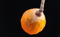
| 01/25/2008 11:27:58 AM | My Little China Berryby Greenman73Comment by ryand: i'll agree with Juliet here, by saying that it isn't a bad shot, it is just a bit boring, maybe adding some color in the background, such as having something blue/purple to complement the main subject. I think this would add a lot to the shot and add some interest for the voters. Really though, it doesn't need much, just adding a few things here and there. |
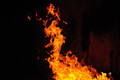
| 01/25/2008 11:22:45 AM | Naked Fireby Greenman73Comment by ryand: I really like this one, one thing that would have helped it a lot would be having the core of the fire on a thirds line, this would bring more visual appeal along with a better score, other than that though a very intriguing shot, fire is a very interesting subject. |
| 01/25/2008 09:23:34 AM | DSC_0986.JPGby Greenman73Comment by Greenman73: Umm..not at all I was just pointing out what I had to do to make the photo Cala has left several very kind comments. I also thank you for taking the time to commment. |
| 01/25/2008 09:16:10 AM | |
| 01/24/2008 09:07:04 PM | My Little China Berryby Greenman73Comment by JulietNN: Just my 2 cents worth, it is not a bad shot at all. The lighting is ok and the focus is good. But to be honest my first gut reaction was, it was a tad boring. It is just sort of sitting there doing nothing. I see more orange than I do yellow, but there is yellow on the righ thand side, maybe with a little stronger lighting behind it making it a little more transparent would have helped with the colour and interest? I think the crop is a little too close. I like the texture that you have got out of it though. |
| 01/24/2008 08:53:16 PM | DSC_0986.JPGby Greenman73Comment by JulietNN: I think that when people give you comments, it is wise to have an open mind about what they are saying, it seems that every comment you have defended your shot to the hilt. The contrasts of the bright colours and the black background really pops. Keep shooting, we all have so much to learn, look forward to learning with you! |
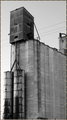
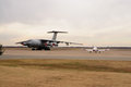
| 01/24/2008 08:47:38 PM | DSC_1159.JPGby Greenman73Comment by JulietNN: The little and large of aeroplanes!!. I think that with the brown grass and pale sky and pale planes, it could do with a crop of the brown grass closer to the runway and crop out the tree would make them more of an impact. |
Home -
Challenges -
Community -
League -
Photos -
Cameras -
Lenses -
Learn -
Help -
Terms of Use -
Privacy -
Top ^
DPChallenge, and website content and design, Copyright © 2001-2026 Challenging Technologies, LLC.
All digital photo copyrights belong to the photographers and may not be used without permission.
Current Server Time: 07/15/2026 04:46:12 PM EDT.
|