| Image |
Comment |
| 05/08/2008 10:00:41 AM |
|
 Photographer found comment helpful. Photographer found comment helpful. |
| 05/08/2008 09:33:46 AM |
Missing An Angelby choltmeierComment by socalsteve: Very moving picture, difficult to make out these are headstones. I don't see triangle composition though, unless I really stretch, so I have to mark this down for not meeting the challenge. |
| Photographer found comment helpful. |
| 05/06/2008 08:41:07 AM |
|
| Photographer found comment helpful. |
| 05/05/2008 10:51:45 PM |
|
| Photographer found comment helpful. |
| 05/05/2008 06:19:04 PM |
Slothby choltmeierComment by Citadel: Greetings from the critique club!
Tough guy to expose for. It would be really nice to get more detail in his hair. Great colors in this shot a nice composition that effectively draws your eye to the animal's face. Looking at this further the highlights work well as rim lighting which further emphasizes the subject. As an aside, it would be nice if the commenter below supplied more information on WHY they gave this shot a 2 because I don't feel it deserves anything less than a 6. |
| Photographer found comment helpful. |
| 05/03/2008 12:07:51 PM |
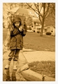
Rainy Dayby choltmeierComment by Venom: Very nice angle to this image. The thick border is a little distracting but the expression on their face is to die for! |
| Photographer found comment helpful. |
| 05/02/2008 05:08:42 AM |
Rainy Dayby choltmeierComment by h2: good focus and clarity; I think sepia doesn't fit here too well, this would work better with a blueish tint or in muted color (I understand this couldn't have been entered here) |
| Photographer found comment helpful. |
| 05/01/2008 05:44:41 PM |
Rainy Dayby choltmeierComment by aj1621: This really caught my eye, I like it a lot. The lighting and everything is really nice. I think the only thing that could have made it a little better would be if it were sprinkling on her. |
| Photographer found comment helpful. |
| 04/30/2008 10:34:57 PM |
Rainy Dayby choltmeierComment by signal2noise: I like the shot and I love the angle it was taken. I don't think that Sepia complements this image though. I think this would be much better served as greyscale or heavily desaturated. |
| Photographer found comment helpful. |
| 04/30/2008 10:24:32 PM |
Rainy Dayby choltmeierComment by ShutterPug: Nice work. Too bad you cannot add an overlay in basic editing as I think an overlay to look like paper crackles across it would really make this look like an old faded b/w sepia |
| Photographer found comment helpful. |
Home -
Challenges -
Community -
League -
Photos -
Cameras -
Lenses -
Learn -
Help -
Terms of Use -
Privacy -
Top ^
DPChallenge, and website content and design, Copyright © 2001-2026 Challenging Technologies, LLC.
All digital photo copyrights belong to the photographers and may not be used without permission.
Current Server Time: 07/28/2026 02:10:57 AM EDT.