Illusionby
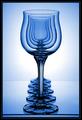
Spanish_GreaseComment by sn4psh07: I recognise this -- its a parody of a shot by John Freeman in a book he reacently wrote. You should have taken more care lining up the glasses and kept them away from the edge of the table. You even seem to have copied the black card on either side of the glasses. No originality unfortunately, and only a moderate reproduction.
Sharp, nice colors (Like the original) and not too much noise. Had I not seen it before and apart from the lack of care lining up the glasses you would have got 7 or 8. I do however hate copies so sorry but 5.
My appologies if you had not seen mr. Freemans picture.
Edit: --
in retrospect it has occurred to me that many people do well on the site with parody photographs. Therefore my initial opinion was a little bit harsh, and I have changed your vote to a six.
I have also check again on the original that I saw, and it had a white background so I do quite like your blue background as it complements the glasses quite well. The top of your front most glasses also has a slightly uneven edge at the top of it, and this does draw your eye towards it -- which is a little bit distracting.
In order to line the classes up better I would recommend using two rulers on the bases of the glasses so that you can guarantee that they are straight.
Overall a very good picture.