My Last Oneby
Spanish_GreaseComment by Harz_Joerg: Greetings from the Critique Club
Initial thoughts/My opinion
Great stuff, very well composed. Like the use of inverting the picture.
Content/Composition
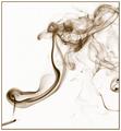
Very well made! I especially like the ratio between the small cigarette and the large smoke and how you positioned the cigarette and the smoke along the diagonal.
Also, as it has been already mentioned by others, the use of negative space is great.
The only flaw I can think of is the darker portion of smoke at the lower right: elsewhere one has the feeling to see almost the whole smoke and only small portions have already faded out of the frame, but at the lower right the "thick" smoke is cut, so the viewer knows that there is more smoke around.
But this is really a minor issue.
Camera work -technically
Everything done as it should be: exposure and focus is right (judged it by inverting the image back).
Digital Processing - Technical
Inverting the image was a very good idea: it does not look unnatural, but gives it a final kick. That the inversion results directly in a sepia was a surprise to me. The border works very well too.
Fits the challenge
Of course it does and I hope you still keep your resolution (unless you didn't ever smoke at all). I tried to stop this year, but I failed.
Good luck for your upcoming submissions.