Simply Simpleby
JulietNNComment by Chinarosepetal: Critique Club
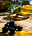
Hi Juliet, Here's my take on your oil challenge image :)
First impressions
A sunny image with a Mediterranean feel
A little bit later
I still had a warm feeling from the image but I was starting to struggle. I'm not sure where the focus of the image is - I think probably the cleverly caught drop of oil, but that doesn't appear to be sharp, my eye moves on - maybe the drop of oil on the top olive, again not sharp enough. The olives themselves are dark, and a bit off-putting because of it. The glass carafe however has caught some wonderful colours and the hint of a glass bowl in the background is delightful. And then, back down at the olives, the lone olive on the right next to a pool of luscious oil is what I think you were trying to capture in it's simplicity - better focus and lighting here, a lovely tasty, sunny moment :)
A summing up
The idea behind the image is good and meets the challenge well. The composition works well and you've timed the shot perfectly. The image is let down by a lack of focus in the important areas and the need for more light falling onto the olives. I see you were in your kitchen, maybe there's a bit of tin foil/aluminum foil lying around that you could use to redirect some of that sunlight!
I note you were disappointed by your score, but you were a fraction above the average score which is not a bad place to be :) Thank you for allowing me to linger in your sunny kitchen, I promise I didn't eat any of the props ;)