| Image |
Comment |
| 05/22/2013 03:36:49 AM |
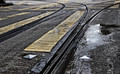
Fork?by TiberiusComment by VuurVliegie: For me the fork should lead somewhere. Something promising vs. danger ahead. Near your destination, vs. still a long way to travel. Crisp and clear. 6 |
 Photographer found comment helpful. Photographer found comment helpful. |
| 05/22/2013 02:17:23 AM |
|
| Photographer found comment helpful. |
| 05/22/2013 01:39:23 AM |
|
| Photographer found comment helpful. |
| 05/22/2013 12:45:59 AM |
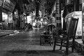
Melancholy Woman by TiberiusComment by Tiberius: Originally posted by docpjv:
I do not care if I may guess that this is a Tibbi; this is a 10. At least! |
Got me, Peter! Message edited by author 2013-05-22 00:46:35. |
| 05/22/2013 12:19:53 AM |
|
| Photographer found comment helpful. |
| 05/22/2013 12:12:25 AM |
|
| Photographer found comment helpful. |
| 05/21/2013 11:11:48 PM |
Melancholy Womanby TiberiusComment by nam: Top two for me. I love the "pose" and expression - and the chairs in the street. Voted earlier. Back to comment. |
| Photographer found comment helpful. |
| 05/21/2013 10:41:52 PM |
|
| Photographer found comment helpful. |
| 05/20/2013 04:57:10 PM |
|
| Photographer found comment helpful. |
| 05/20/2013 03:01:48 PM |
Forestby TiberiusComment by MaryO: Nicely moody, with that bright meadow up ahead, undoubtedly filled with flowers and butterflies and abundant, warm sunshine. |
| Photographer found comment helpful. |
Home -
Challenges -
Community -
League -
Photos -
Cameras -
Lenses -
Learn -
Help -
Terms of Use -
Privacy -
Top ^
DPChallenge, and website content and design, Copyright © 2001-2026 Challenging Technologies, LLC.
All digital photo copyrights belong to the photographers and may not be used without permission.
Current Server Time: 05/17/2026 11:19:31 PM EDT.