DPChallenge: A Digital Photography Contest You are not logged in. (log in or register
 
Browse Settings
Currently viewing:
Registered Userredhed

Show comments:

Per page:

Order:

Comments:


Comments Received by redhed
Pages:  
Showing 1 - 10 of ~42
Image Comment
summer
08/26/2003 10:07:24 PM
summer
by redhed

Comment by myork:
heh :)
summer
08/25/2003 09:56:15 PM
summer
by redhed

Comment by Fayech:
hehhe. cute, love the blow fish! :o)
summer
08/22/2003 09:52:40 PM
summer
by redhed

Comment by readme:
Great expression caught! This screams summer to me... kid, water, fishy! He's having a ball! Composition-wise I'd like to see less of that lil' arrow to the right and more of that cute fish. I enjoyed your photo!
summer
08/20/2003 04:19:56 PM
summer
by redhed

Comment by alanfreed:
Looks like somebody got a Happy Meal from McDonald's during their Nemo promotion! (I have numerous of these things around the house...) Cute shot -- I like the way you caught the water droplets.
summer
08/20/2003 10:05:08 AM
summer
by redhed

Comment by pottersclay75:
great capture of a moment. good emotion and mood here
my house
06/10/2003 02:15:05 PM
my house
by redhed

Comment by HBunch:
*Critique Club*
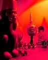
I'm tossed on the lighting here. On one hand, I think that it adds some dramatic effect, on the other though, I think it's quite too strong and ruins a lot of the detail we could have seen here.
I think my final decision is that it is negative to the photo.
You have chosen a nice angle to shoot these things. It's not too busy, and it does say something about yout home.
However, the red light takes away a lot of detail. It's too overpowering, and actually erases things out of the photo. See the 2 little objects at the feet of the monkey to the left? They are only litle blobs, we can't see through the powerful color to even get a shape out of them.
The focus looks like it's in the far back on the head wearing the pointy hat. This looks to be the sharpest focus. The monkey to the left is not well focused at all. And that also hurts any details we could get here.
Can you tell I'm a fan of detail? lol
Anyway, I think it fits the challenge nicely, and the colors work nicely on the background, however, not on the objects themselves.
~Heather~
Photographer found comment helpful.
my house
06/03/2003 04:46:05 PM
my house
by redhed

Comment by skief:
Doesn't seem sweet to me.
my house
06/03/2003 12:24:06 PM
my house
by redhed

Comment by frisca:
wow, that's one freaky shot with that lighting! This shot makes your house look like a scary place to be! :)
my matrix
06/02/2003 11:22:02 PM
my matrix
by redhed

Comment by HBunch:
*Critique Club*
Lighting is an issue in this shot. The pills are almost over lit, and the bottle isn't lit enough. I don't like the harsh shadow created by the front pill onto the pill behind it. It kind of takes a chunk right out of the pill in the back. Probably lighting this more, and just putting a thin sheet or paper between the light and your subject might provide enough light, but cut down on glares created by too much lighting.
While I realize it's probably the label that's tilted, the tilt of the lettering really makes this look like everything is going to slide right off the right side of the photo. See how the lettering doesn't line up with the upper frame of the photo? Being so close to the edge, it's really obviously tilted and creates a distraction.
I'm glad you have cropped this to cut out your address and RX number. I saw a shot once that left all that info in, and I was freaked out. Couldn't believe someone would have given out all that info. So the crop there is appropriate to me. You could have carefully cut it out and then shows the entire bottle, but I don't think it would have been as effective.
Focus and clarity seem to be just fine. Good detail in the pills, and the lettering on the bottle isn't blurred or anything.
The black background also works nicely as there is nothing distracting in the background. Also helps to make the subject stand out.
I think that just about anything would qualify to be in this challenge, so I think it fits the challenge nicely.
~Heather~
Photographer found comment helpful.
my house
06/02/2003 11:03:05 PM
my house
by redhed

Comment by eloise:
The pumped saturation is, for me, kind of distracting, but that's a personal choice. If it accentuated the composition or helped direct the eye, it might not detract from my vote; but as it is, combined with the utter lack of focus anywhere in the frame, 4.
Photographer found comment helpful.
Pages:  
Showing 1 - 10 of ~42


Home - Challenges - Community - League - Photos - Cameras - Lenses - Learn - Help - Terms of Use - Privacy - Top ^
DPChallenge, and website content and design, Copyright © 2001-2025 Challenging Technologies, LLC.
All digital photo copyrights belong to the photographers and may not be used without permission.
Current Server Time: 08/01/2025 12:54:30 AM EDT.