| Image |
Comment |
| 12/05/2007 10:23:16 PM |
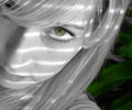
greenby laurie241Comment by Ivory: I like the selective desat, the pale skin is very interesting with the shadows on it. Good job. |
 Photographer found comment helpful. Photographer found comment helpful. |
| 12/05/2007 09:49:54 PM |
greenby laurie241Comment by walrus451: love this angle and the fact that you can only see one eye....very nice. you may be getting comments about dodging and burning and in this case burning around the eye and the iris will add depth and contrast to that area. overall I would have to say that I really like this....; ) |
| Photographer found comment helpful. |
| 12/05/2007 04:40:40 PM |
greenby laurie241Comment by bs-photos: The lighting across your face are a nice effect, and I think the selective desat makes this shot interesting. I might've boosted the contrast just a bit to get more detail in your hair, just a thought though. |
| Photographer found comment helpful. |
| 12/05/2007 03:13:17 PM |
greenby laurie241Comment by got2bgutsy: Nice shot. I wish the lines of light weren't on your face because it's a bit distracting, but overall this is a great picture! Good luck! |
| Photographer found comment helpful. |
| 12/05/2007 02:31:47 PM |
greenby laurie241Comment by docurrie: light streaks on the face are a little harsh but the eyes are fantastic, love the way the green goes with the background. |
| Photographer found comment helpful. |
| 12/05/2007 02:09:03 PM |
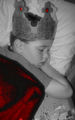
little princeby laurie241Comment by dacrazyrn: I don't think selectively saturating the red was the best idea. It detracts away from the main subject. I keep looking into the left, bottom corner. |
| 12/05/2007 08:42:46 AM |
little princeby laurie241Comment by spencerwood: Quite a strange depth of field effect you have going on but the face is in focus which is the important thing here so thats good. Not sure the red colouring works, normally you would have single coloured objects in a mostly mono image to draw attention, but here, the red elements are not in focus and the main points of interest given you title and the brief should be the boy and the book which are left mono. So your intention by doing this colouring seems a little confused. Mono tones could have been pushed harder as they are a little washed out |
| 12/05/2007 08:38:41 AM |
greenby laurie241Comment by jimness: this is really close to being great - excellent composition, but just not contrasty / sharp enough for me. Give those eyes some serious dodge n burn and USM and you'd have a different story |
| Photographer found comment helpful. |
| 12/05/2007 07:40:36 AM |
|
| 12/05/2007 04:26:23 AM |
greenby laurie241Comment by waou85: nice shot and great colors, but i would preffer more of a portrait than a closeup, just my opinion |
| Photographer found comment helpful. |
Home -
Challenges -
Community -
League -
Photos -
Cameras -
Lenses -
Learn -
Help -
Terms of Use -
Privacy -
Top ^
DPChallenge, and website content and design, Copyright © 2001-2026 Challenging Technologies, LLC.
All digital photo copyrights belong to the photographers and may not be used without permission.
Current Server Time: 07/17/2026 12:36:09 AM EDT.