| Image |
Comment |
| 08/20/2003 12:09:33 AM |
|
 Photographer found comment helpful. Photographer found comment helpful. |
| 08/19/2003 09:22:13 PM |
|
| Photographer found comment helpful. |
| 08/19/2003 07:04:33 PM |
trapped...by wetlandComment by Imagineer: A quite bizarre image when it first loads. Gotta be a toy house, but the title is a bit odd and it leaves me feeling that I'm missing something. [5] |
| Photographer found comment helpful. |
| 08/19/2003 06:01:46 PM |
|
| Photographer found comment helpful. |
| 08/19/2003 05:46:49 PM |
|
| Photographer found comment helpful. |
| 08/19/2003 01:47:08 PM |
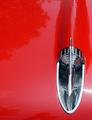
1957 - A Good Vintage Redby wetlandComment by mzanoni: Very eye catching. You've gone for a very graphical look to this image and so I only wish the lines contained in the silver object (fin decoration?) were more perpendicular rather than at a tilt. BUT, that said, this caught my eye over and over again. So good job. |
| Photographer found comment helpful. |
| 08/19/2003 11:46:48 AM |
|
| Photographer found comment helpful. |
| 08/19/2003 08:37:49 AM |
1957 - A Good Vintage Redby wetlandComment by BobsterLobster: Took me a little while to get my bearings here! Nice idea, but I don't like the glare at the bottom right of the frame, and there are too many reflections in the paint for this to really work as negative space for me. 5 |
| Photographer found comment helpful. |
| 08/18/2003 10:24:13 PM |
|
| Photographer found comment helpful. |
| 08/18/2003 09:38:47 PM |
1957 - A Good Vintage Redby wetlandComment by ChipsDitchman: One of the few submissions that really fit the 'negative space' theme this time around and in my opinion one of the best. Good concept, good framing... the only minor gripes would be the shadowed uneveness on the upper portions of the hood and the bright spot on the lower right...distracts from the chrome, which is where the real lighting emphasis should be.
All in all a great submission though. |
| Photographer found comment helpful. |
Home -
Challenges -
Community -
League -
Photos -
Cameras -
Lenses -
Learn -
Help -
Terms of Use -
Privacy -
Top ^
DPChallenge, and website content and design, Copyright © 2001-2026 Challenging Technologies, LLC.
All digital photo copyrights belong to the photographers and may not be used without permission.
Current Server Time: 06/21/2026 01:31:40 PM EDT.