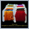
Diversity - Strength in similarities, strength in differencesby
wetlandComment by Konador: Critique Club
Hi. I think this picture shows a great array of colours, with an interesting repeating pattern. The focus and sharpness seems good in the photo, but where you have cut it out from the background you used a feathered tool. This ruins the sharpness in my opinion. It also makes it look more obviously photoshopped. Using an anti-aliased tool instead of feathered would help keep it looking sharp.
The centered composition isnt normally used in photography, but for posters I think it works okay, and is a good choice here.
I don't think the connection between the photo and the text is as strong as some others, but there is a link there. Personally, I don't like the font and colour that you used though. I think the main word, Diversity, should be bigger than the rest, because this is the main message you are trying to give. The font also looks a bit 'cliché' if you know what I mean? Is it Lucida Handwriting or something like that? I think a stronger font, or something a bit different to the norm, would have worked better. Also, Red or orange (as these are the prominent colours in the photo) may have worked better than yellow, or even a neutral colour such as white or grey.
Finally, I don't really like the choice of border. I dont think that you needed anything extra around the black, and if you had to have something, I would have thought a simple one colour border would have worked well, with a 1px keyline in another colour to separate it.