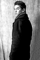
DPChallenge: A Digital Photography Contest You are not logged in. (log in or register
 
Browse Settings
Currently viewing:
Registered Usertaylorpage

Show comments:

Per page:

Order:

Comments:


Comments Received by taylorpage
Pages:  
Showing 1 - 10 of ~87
Image Comment
Piercing
02/02/2009 11:12:20 PM
Piercing
by taylorpage

Comment by photokariangel:
This is Kari Ann, greetings from the Critique Club:

composition: The crop emphasizes the subjects height, and it almost emits the look of him being 24 feet tall. I think this is a great thing in an Ansel Adams Challenge, he tried to capture the heighth and beauty of all the things around him. Well thought out in that contrast.

color: Of course, the Ansel Adams challenge is supposed to be in Black and White, you controlled the tones very well.

contrast: Perhaps a little less contrast on the back of the coat would make the image more soft. But, i think, as well, that the harsh contrast provides emphasis to the title and the entire tone of the image.

focus: Good focus, sharp.

depth of field: i like the background in focus, the textures are reminiscent of those in nature, thus referring back to the theme of the challenge, which is Ansel, and, in a sense, Ansel and nature were one.

lighting: Very dramatic lighting, I keep wanting to say that the bright light to the left is a little distracting, but at the same time, i feel it adds such a definite high light to the image that i feel it would be bland without it.

other: overall, i really enjoy this image. The tones are rich and the full range is present. I can see why some may have voted this photograph down for the lack of a picture of some surreal and otherworldly landscape image, but I also cannot see why they cannot have voted it up for its mere beauty of capturing the dramatic lighting and mood of the image. To each his own, i suppose. You should be very pleased with how this image turned out. And, with this being a self portrait, it adds to a list of self portraits that continue to inspire me to do more. I hope this comment was helpful to you. If you have any questions, feel free to PM me.
-Kari Ann
Piercing
01/27/2009 11:02:09 PM
Piercing
by taylorpage

Comment by ubique:
Are you being carped at over this not being sufficiently Ansel Adams-ish? But I suppose he took portraits as well? (I wouldn't know ... his more celebrated works are not to my taste, so I don't think I'd want to see anything of his in a genre that he was not famous for.)

Anyway, I don't actually care at all about the challenge topic, and I really do like your photograph. 10.
Piercing
01/23/2009 10:17:47 PM
Piercing
by taylorpage

Comment by scooter97:
Good tones. He doesn't look amused!
Piercing
01/21/2009 06:51:24 PM
Piercing
by taylorpage

Comment by vanillabean93:
i do not understand how this is ansel adam's style.
UPSIDE DOWN
11/12/2008 09:15:06 PM
UPSIDE DOWN
by taylorpage

Comment by FocusPoint:
Hello from Critique Club,

(Composition) Your composition is pretty good. I like the way you have negative space there with rule of thirds... the blue color that covers the top of the image... Idea is good and well executed. I am not sure you were planning to use this photo for this challenge; the tip of the boat is almost touching to the frame of your photo, that's bothering me in this whole picture. It's not bad thing, but it takes a bit attention from overall.

(Technical) Some might think the overexposed area on the bottom a bit lighter than it should, but I don't think so. It looks good too. Seems like two boat attached, or stick each other and hanging in the air via a wooden lifter or something.

(Final) If you had a bit more space between the tip of the boat and the frame, I would say you would be taking it to the "6-land"... I think the over exposed area on your photo and being to close to the frame get your votes a little downwards.

(Personal) I checked your other photos. You seem like in right direction, just need some practice and that's it :)

Keep up the good work

Leo
Photographer found comment helpful.
UPSIDE DOWN
11/09/2008 04:41:54 PM
UPSIDE DOWN
by taylorpage

Comment by peter:
Great idea and an excellent reflection. This would have done very good in the upside down contest.
Photographer found comment helpful.
UPSIDE DOWN
11/07/2008 09:05:52 AM
UPSIDE DOWN
by taylorpage

Comment by phlover:
Love the idea of flipping the picture.
Photographer found comment helpful.
UPSIDE DOWN
11/03/2008 04:39:42 PM
UPSIDE DOWN
by taylorpage

Comment by rlewis:
I think it would have been better right side up, but then there would not be a place for the nose to go.
Photographer found comment helpful.
The Streets of Toronto Ontario
11/02/2008 09:54:47 PM
The Streets of Toronto Ontario
by taylorpage

Comment by Yo_Spiff:
Reminds me of some of the old b/w photos from my moms scrapbook showing the Bronx in the 40's and 50's.
The Streets of Toronto Ontario
11/02/2008 09:03:25 AM
The Streets of Toronto Ontario
by taylorpage

Comment by Coley:
A good idea ... watch your exposure... a little bit blown out on the walk
Photographer found comment helpful.
Pages:  
Showing 1 - 10 of ~87


Home - Challenges - Community - League - Photos - Cameras - Lenses - Learn - Help - Terms of Use - Privacy - Top ^
DPChallenge, and website content and design, Copyright © 2001-2025 Challenging Technologies, LLC.
All digital photo copyrights belong to the photographers and may not be used without permission.
Current Server Time: 06/16/2025 10:45:00 AM EDT.