| Image |
Comment |
| 01/31/2008 02:41:25 PM |
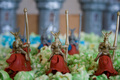
Parliament by BujanxComment by Matthew: nice subject matter andcomposition, but light is not ideal - too much shadow |
 Photographer found comment helpful. Photographer found comment helpful. |
| 01/24/2008 01:31:50 PM |
Lost our Topsby BujanxComment by DrAchoo: Technicals: As I'm sure you can guess, this is pretty underexposed. You might have been able to save it in Photoshop or another program, but sometimes raising the exposure of an underexposed shot will bring out a bunch of noise. The composition is not bad at all. It is not centered, which is good, and I like the blurred "top" in the background.
The feel: I think it's a creative idea. The composition, like I mentioned, is what makes the photo. I will admit though, that shots of little trinkets and kitsch like this rarely do well on DPC. |
| Photographer found comment helpful. |
| 01/24/2008 12:00:44 PM |
Hole in the wallby BujanxComment by ryand: Incredibly interesting subject, I'll agree with citadel in that the bricks on the left are too dark making them harder to notice at first glance. Also one thing that the voters like in general would be adding a unique perspective. Hope all these comments helped, PM me if you have any questions. |
| Photographer found comment helpful. |
| 01/24/2008 11:57:53 AM |
Playing with Popcornby BujanxComment by ryand: One reason on this for the poor score is that it has poor lighting. A very good investment would be to get a cheap speedlight (an offbrand one would do) that you can use to bounce light off of the ceiling which will make a lot better lighting. Also some people may see the idea as too "childish", just cause lots of people are looking for crazy creative ideas. |
| Photographer found comment helpful. |
| 01/24/2008 11:54:54 AM |
s'no manby BujanxComment by ryand: Another great idea for this challenge. It looks a little blurry or missed focus. Also you may try lighting it from the side to add more contrast and interest to the shot. Just a few minor things to fix to add a whole lot to this shot. |
| Photographer found comment helpful. |
| 01/24/2008 11:53:01 AM |
Lost our Topsby BujanxComment by ryand: This shot has a lot of potential but it needs a few things. Adding contrast with your lighting would help this shot a lot. Also another thing would be making the background either a solid color, or a gradient of sorts. Those two things alone would add a lot. Also maybe try arranging them where they lead to the tops in the background to make that part stand out more, really nice idea. |
| Photographer found comment helpful. |
| 01/24/2008 11:48:56 AM |
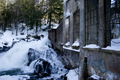
1905 super-phosphate plantby BujanxComment by ryand: First thing i thought when i saw this shot was that i would liked to have seen more of the building in this shot, and maybe used a different, more interesting perspective, maybe closer to the building, not really sure, but i think that that would add a whole lot to the shot. |
| Photographer found comment helpful. |
| 01/23/2008 09:04:41 AM |
1905 super-phosphate plantby BujanxComment by Bujanx: Originally posted by Greenman73:
I would like to see more of this place I bet it has quite the atmosphere. |
If you really want to see more of the building - here are some shots I took this summer
//www.edgedesign.ca/Photos/meech/
Cheers
|
| 01/22/2008 03:06:11 PM |
|
| Photographer found comment helpful. |
| 01/20/2008 11:36:01 PM |
|
| Photographer found comment helpful. |
Home -
Challenges -
Community -
League -
Photos -
Cameras -
Lenses -
Learn -
Help -
Terms of Use -
Privacy -
Top ^
DPChallenge, and website content and design, Copyright © 2001-2026 Challenging Technologies, LLC.
All digital photo copyrights belong to the photographers and may not be used without permission.
Current Server Time: 04/01/2026 01:37:33 PM EDT.