| Image |
Comment |
| 07/18/2003 12:52:46 AM |
Just us.by BobsterLobsterComment by wingy: I'd just like to second my original request that you might upload the pre-filter version of this shot. I have such mixed feelings about this shot and I'd really be interested in seeing whether I like it better without the filter or whether I'm wrong on that. |
 Photographer found comment helpful. Photographer found comment helpful. |
| 07/17/2003 07:31:10 PM |
Dangerby BobsterLobsterComment by justine: The more I look at this the more I like it. Has a great feel, mystery, intrigue. It's really nice. I don't care for the border, but it's good work. |
| Photographer found comment helpful. |
| 07/17/2003 05:37:42 PM |
|
| Photographer found comment helpful. |
| 07/17/2003 03:48:30 PM |
Heart Thawby BobsterLobsterComment by jgal76: Excellent idea, just wish the upper left part of the heart were more in focus as its the only unclear part of the picture. Also the border seems to be crowding in on the left part of the heart. 7 |
| Photographer found comment helpful. |
| 07/17/2003 02:35:48 PM |
Heart Thawby BobsterLobsterComment by adine: I like the green background - it makes me thin of soft moss. Lots of nice little details in the ice - a little soft on the left edge, but what can you do with melting ice? |
| Photographer found comment helpful. |
| 07/17/2003 07:54:17 AM |
Just us.by BobsterLobsterComment by Inga_fang: very personal, good use of negative space, lovely colors, good skin tone, this one is really good, i give it a 10 |
| Photographer found comment helpful. |
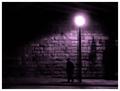
| 07/17/2003 07:37:51 AM |
Dangerby BobsterLobsterComment by inspzil: Greetings from the Critique Club
By Inspzil
Composition - Well I'm gonna take a stab at the question that I think you're trying to ask. "What is that bright glowing thing up there?" I don't know if that's it, but maybe its another interpretation. At any rate, I think it meets the challenge. The concept is good. The lighting of this shot is really good. The overexposure of the streetlamp and the dim light on the street are very well done and balanced where one is not too dark and the other not too bright. The subjects pose is convincing too. Good work.
Technical - I think the only thing that kept this one from getting any higher is the motion blur of the subject. Meaning you should've just froze and took the picture midstep instead of walking. It could work as a motion blur if you made it look more intentional. It's kind of in the area where it's almost intentional looking, but not quite. Exposure and framing are right on in this shotl
Overall - pretty well done. Only one thing that I think the voters had to hammer you on, and I am pretty sure they did. But I think it is a pretty good picture. The focus issue will never die here. If you don't make it look sooooo obvious that you did this on purpose, voters will think you messed up. At least half of them I believe will think that when a picture isn't crystal clear. Good luck in the future challenges - Bob |
| Photographer found comment helpful. |
| 07/16/2003 03:36:16 PM |
|
| Photographer found comment helpful. |
| 07/16/2003 02:01:59 PM |
|
| Photographer found comment helpful. |
| 07/16/2003 01:22:12 PM |
|
| Photographer found comment helpful. |
Home -
Challenges -
Community -
League -
Photos -
Cameras -
Lenses -
Learn -
Help -
Terms of Use -
Privacy -
Top ^
DPChallenge, and website content and design, Copyright © 2001-2026 Challenging Technologies, LLC.
All digital photo copyrights belong to the photographers and may not be used without permission.
Current Server Time: 07/22/2026 11:18:18 AM EDT.