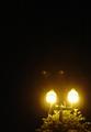
DPChallenge: A Digital Photography Contest You are not logged in. (log in or register
 
Browse Settings
Currently viewing:
Registered Usereloise

Show comments:

Per page:

Order:

Comments:


Comments Received by eloise
Pages:   ... ...
Showing 51 - 60 of ~173
Image Comment
Knitted Texture
06/26/2003 10:15:37 PM
Knitted Texture
by eloise

Comment by mci:
there is a similar shot in this challenge of a feather which i left some comments on. basically, i think that you've chosen a subject that is very tonally flat, and it's not allowing any contrast to come into the image. it's not showing us any light, which is the essence of photography. 3.
Retro Glow
06/26/2003 03:58:37 PM
Retro Glow
by eloise

Comment by eloise:
That would be this, uabresch :->
Retro Glow
06/26/2003 03:44:42 PM
Retro Glow
by eloise

Comment by ursula:
FROM THE CRITIQUE CLUB (the official critique :)

Hello, Eloise,

First of all, I agree with your commenters below that the two light spots are probably lens flare. It's a pity you couldn't edit them out for the challenge.

First impressions: The off-center nature of this shot is, IMO, off-center to satisfy the challenge, not because it adds to the picture. You are too far away from the subject.

Light / focus: It's difficult to take good night pictures, especially with a not so good camera. The yellowish cast is harsh. The focus seems off, nothing in the picture is crisp and clear, but the photo is not sufficiently "out of focus" to create a foggy or nightly/ghostly mood (something like that).

Composition: This is where IMO your picture suffers most. You need to get closer. Did you start with a larger image? IMO the shot could be cropped a long way and possibly be better. You also could straighten the lamp-post, parallel to the side of the pict. Also IMO, this particular pict would work better either in b/w or colourised. I played around with your pict a bit (hope you don't mind, and remember I'm starting from a small image) and am sending you result by email attachment (I don't know how to put it in here).

Overall: Not a bad idea, but the execution could be better. Keep going! If nothing else, you do have a lot of "spunk"! Take care,

Ursula (uabresch)
Complaints, comments, questions ... feel free to email me.
Photographer found comment helpful.
Knitted Texture
06/25/2003 09:57:34 PM
Knitted Texture
by eloise

Comment by dsidwell:
The directional light adds depth to the texture, which is good! You've also found some interesting pattern variations to show us.
Photographer found comment helpful.
Retro Glow
06/23/2003 02:08:43 PM
Retro Glow
by eloise

Comment by wewillexplore:
Unofficial Crit Comment

First off, I agree that it looks like lens flare.

Second of all, you broke 4, so you passed the "anything is better than Mav's 3.9" mark.

Third - the lights seem off center for the purpose of being off center, not because it adds to the picture.

Happy shooting!
Photographer found comment helpful.
Men at Work
06/23/2003 01:06:56 PM
Men at Work
by eloise

Comment by ss:
Needs more light... curve adjustment in PS would have done it, I think...
Woe is Me
06/23/2003 10:57:46 AM
Woe is Me
by eloise

Comment by kiwiness:
An original composition, interesting cropping. The photos is way out of focus tho, either that or you moved the camera whilst taking the photo. Maybe you should have taken a few tries at it, or applying the USM might have done something for it too.
Photographer found comment helpful.
Men at Work
06/23/2003 12:49:45 AM
Men at Work
by eloise

Comment by RLS:
A little too dark. Picture cropped too small. Other than that this meets the cahllenge, has good focus, and is somewhat interesting. I'll give you a 6. Bob
Photographer found comment helpful.
Knitted Texture
06/22/2003 12:22:19 AM
Knitted Texture
by eloise

Comment by Firstrich1:
If your number changed its because I came back through after reading and understanding more of how to do this and also I re-set my monitor. yours looks much better.8
Knitted Texture
06/21/2003 11:43:06 PM
Knitted Texture
by eloise

Comment by LindaLee:
I can barely make out a few pixels that are a TINY bit lighter than the black. Basically this is just a black box, as I see it. Not much impact visually for me!
Pages:   ... ...
Showing 51 - 60 of ~173


Home - Challenges - Community - League - Photos - Cameras - Lenses - Learn - Help - Terms of Use - Privacy - Top ^
DPChallenge, and website content and design, Copyright © 2001-2025 Challenging Technologies, LLC.
All digital photo copyrights belong to the photographers and may not be used without permission.
Current Server Time: 08/01/2025 08:56:32 PM EDT.