| Image |
Comment |
| 07/14/2003 12:06:16 AM |
|
| 07/13/2003 10:57:44 AM |
|
| 07/13/2003 01:38:32 AM |
|
 Photographer found comment helpful. Photographer found comment helpful. |
| 07/12/2003 10:18:42 PM |
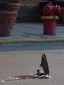
HM - Unpleasant Answerby eloiseComment by BobsterLobster: Really unpleasant photo... I'm sure I won't be the first to say so. As a photo... the focus isn't very sharp, and it could do with a levels adjustment in Photoshop, there doesn't seem to be enough tonal contrast. Don't like the shadow running mid-way across. The top half of the photo looks carelessly composed. I don't like the way the pavement cuts the picture in half. 3 |
| Photographer found comment helpful. |
| 07/12/2003 06:17:59 PM |
HM - Unpleasant Answerby eloiseComment by dsidwell: I like the contrast of the drama and emotion of the dead bird with the random everyday items behind. It gives this image a sense of meaninglessness. Nice work. |
| Photographer found comment helpful. |
| 07/11/2003 04:46:45 PM |
HM - Unpleasant Answerby eloiseComment by K-Rob: Okay, I'll hit you...Not sharp enough, bad lighting, disgusting sujbect matter. =) Wow, I've never been that forrward in commenting. It feels like I"m being a jerk. |
| Photographer found comment helpful. |
| 07/11/2003 03:16:31 PM |
HM - Unpleasant Answerby eloiseComment by ursula: The concept is OK. Colours are rather dull, greyed out, almost softish. It seems to me that for this concept you'd need either a strong duotone/bw presentation, or better colours. Also, I think the vertical format doesn't do justice to the picture: all the distracting elements to the top are "distracting". The flower pots in particular give a sense of peace and tranquility that doesn't seem to go with the dead bird. I guess, what I'm trying to say is that in general a good photo addresses one concept or issue squarely, no distractions (remember, I said "in general"), and in this case I don't see why breaking this general guideline helps. |
| Photographer found comment helpful. |
| 07/11/2003 01:23:42 PM |
|
| 07/10/2003 09:59:50 PM |
HM - Unpleasant Answerby eloiseComment by karmat: I like the composition (though the subject choice doesn't appeal that much), but the exposure seems off somehow. It is bright enough, but there doesn't seem to be a lot of "detail" visible. (Of course, that might be a good thing) |
| Photographer found comment helpful. |
| 07/09/2003 07:37:42 AM |
|
Home -
Challenges -
Community -
League -
Photos -
Cameras -
Lenses -
Learn -
Help -
Terms of Use -
Privacy -
Top ^
DPChallenge, and website content and design, Copyright © 2001-2026 Challenging Technologies, LLC.
All digital photo copyrights belong to the photographers and may not be used without permission.
Current Server Time: 07/26/2026 02:55:36 PM EDT.