| Image |
Comment |
| 09/18/2008 12:34:45 PM |
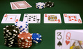
"All-In"by shollingComment by peter: I like it! I wish the two cards at the bottom were a little more in focus. |
 Photographer found comment helpful. Photographer found comment helpful. |
| 09/17/2008 12:27:09 PM |
|
| Photographer found comment helpful. |
| 09/17/2008 05:13:52 AM |
|
| Photographer found comment helpful. |
| 04/03/2008 03:14:26 AM |
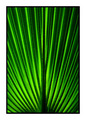
Radiateby shollingComment by Melethia: It moves when you scroll - cool! I think I see what you mean about it being ungrounded without the frame, though. DPC is kinda "eh" on borders - but if you like them with a shot, use them. Try without first (which you did) then go with your gut instinct. You picked a good subject to shoot for the challenge - great color, good exposure, pretty good composition for this subject, too. You may also want to try shooting this with a strong diagonal - in some ways that may counteract the optical illusion just a bit. |
| Photographer found comment helpful. |
| 04/02/2008 12:04:57 PM |
Radiateby shollingComment by sholling: Originally posted by eyewave:
I found the border to be too bold, while the image itself is too small. try to make the most of the 640 px height you have. The black border alone would have given enough depth. If your image lost sharpness during resizing, you probably don't use the best resizing method; in photoshop it would be "bicubic sharper" when downsizing. |
Tx  eyewave eyewave, point taken re border, without the white border the warp effect is still quite strong thoug. Just did a test with the different resizing method and it makes a considerable difference, thanks for that Message edited by author 2008-04-02 12:12:56. |
| 04/02/2008 08:29:08 AM |
Radiateby shollingComment by h2: I found the border to be too bold, while the image itself is too small. try to make the most of the 640 px height you have. The black border alone would have given enough depth. If your image lost sharpness during resizing, you probably don't use the best resizing method; in photoshop it would be "bicubic sharper" when downsizing. |
| Photographer found comment helpful. |
| 04/01/2008 12:31:19 AM |
Radiateby shollingComment by Yo_Spiff: Makes a nice bold semi-abstract. I like the backlit green. I find the border excessively wide, though. |
| Photographer found comment helpful. |
| 03/31/2008 09:23:40 AM |
Radiateby shollingComment by nabusl: the lines in this photo define the positive characteristics of this image. |
| Photographer found comment helpful. |
| 03/30/2008 04:55:44 PM |
Radiateby shollingComment by tootsweet: This is pretty, but for some reason it misses my "Wow" button. Send this to the critique club or the forums and I bet you could get some great ideas. |
| Photographer found comment helpful. |
| 03/28/2008 11:21:04 AM |
|
| Photographer found comment helpful. |
Home -
Challenges -
Community -
League -
Photos -
Cameras -
Lenses -
Learn -
Help -
Terms of Use -
Privacy -
Top ^
DPChallenge, and website content and design, Copyright © 2001-2026 Challenging Technologies, LLC.
All digital photo copyrights belong to the photographers and may not be used without permission.
Current Server Time: 07/15/2026 12:08:40 PM EDT.