| Image |
Comment |
| 04/08/2003 10:36:43 AM |
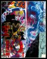
Graffiti in the Sunby greenem2Comment by cq107: Artwork. Literal photographic representations of the entirety of existing works of art (including your own) are not considered acceptable submissions, however creative depictions or interpretations are permissible. This includes, but is not limited to paintings, sculptures, photographs, drawings, and computer artwork. |
| 04/08/2003 10:15:36 AM |
Graffiti in the Sunby greenem2Comment by dadas115: This is not one of my favorite subjects but I think you have done a good job with it. I think it meets the color challenge very well and overall I think the picture is well done. The shadows add a lot to the photo. I don’t know if you planned it this way or not but they really help the composition and make the picture more interesting for me. There certainly is a lot to look at here that would be missed by the frantic reviewer trying to get through the whopping 300 submissions from this week, but I am glad I took the time to look at it. The more I look at this picture the more I like it. I really can’t think of anything I would change about it. I gave this one a 7.
Greg
|
 Photographer found comment helpful. Photographer found comment helpful. |
| 04/07/2003 04:22:54 PM |
Flameby greenem2Comment by jmsetzler: Greetings from the Critique Club :)
This is an excellent macro shot. The detail on the lighter is quite impressive. I think the overexposure on the flame is excellent because it creates nice lighting for the rest of the image.
I really feel at a loss for a decent critique on this photo because I can't suggest improvement for it. There are lots of options you could try with the background, but this one just seems to work as is without any help.
Keep up the great work :)
John Setzler
|
| Photographer found comment helpful. |
| 04/07/2003 01:13:03 PM |
|
| 04/07/2003 12:51:57 PM |
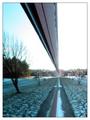
Suburban Reflectionby greenem2Comment by karmat: CRITIQUE CLUB CRITIQUE
by karmat
COMPOSITION
You have definitely met the challenge. I think that it is effective how the lines start on the upper and lower left and proceed down and through the frames. It really gives the eyes a nice path to follow.
TECHNIQUE
The picture seems to be a bit hazy to me. Not from lack of focus or anything, just not real clear and distinct. Perhaps it was the time of day that you were shooting?? Also, I think the overexposed parts in at the end of the reflection are a little distracting. Could you have shot from the other end, or at another time of day?
OVERALL EFFECT
You have definitely achieved a symmetrical shot, and one that is very interesting. I found myself looking at both halves to see which was "real" and which was the reflection. Good work.
best to you in future challenges.
karmat |
| Photographer found comment helpful. |
| 04/07/2003 10:33:11 AM |
|
| 04/07/2003 10:25:41 AM |
|
| 04/06/2003 11:40:25 PM |
|
| 04/06/2003 01:17:15 PM |
Flameby greenem2Comment by wewillexplore: Excellent detail on the lighter. The flame is abit overexposed, but ... what can ya do, it's FIRE, right? :) Every week there's a shot I absolutely do not like that does well - I think this is that shot this week...good luck! |
| 04/06/2003 11:03:08 AM |
Flameby greenem2Comment by inspzil: This would've been a really cool picture if it wasn't quite so overexposed |
Home -
Challenges -
Community -
League -
Photos -
Cameras -
Lenses -
Learn -
Help -
Terms of Use -
Privacy -
Top ^
DPChallenge, and website content and design, Copyright © 2001-2026 Challenging Technologies, LLC.
All digital photo copyrights belong to the photographers and may not be used without permission.
Current Server Time: 07/16/2026 08:11:51 AM EDT.