| Image |
Comment |
| 05/17/2009 11:02:34 PM |
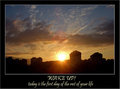
Wake up!by fitz3000Comment by kaiser_chief: nice photo, and nice overall combination. The phrase and title match the photo and compliment each part well.
The photo is good, but perhaps the sun being centred maybe isn't the strongest thing. Having it to one side, on the third line, may have helped against this, and given an even more broad range of colours. Further to that, a little extra dark foreground would also have balanced this photo much more.
Don't know why you opted for the text colour being different from the border. Having both of these in the blue would have kept the entire poster together more and given a more finished and professional look. |
 Photographer found comment helpful. Photographer found comment helpful. |
| 05/17/2009 10:28:03 AM |
|
| Photographer found comment helpful. |
| 05/14/2009 03:32:13 PM |
|
| Photographer found comment helpful. |
| 05/14/2009 12:36:42 PM |
Wake up!by fitz3000Comment by MistyMucky: Very effective composition, I love the wide angle which shows different layers in the sky! |
| Photographer found comment helpful. |
| 05/12/2009 10:37:02 PM |
|
| Photographer found comment helpful. |
| 05/12/2009 09:34:21 PM |
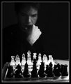
The Seventh Sealby fitz3000Comment by bcenu: Good lighting and well framed although I thought the white specs on his shoulders were dust on my monitor. |
| Photographer found comment helpful. |
| 05/11/2009 05:53:10 PM |
The Seventh Sealby fitz3000Comment by LadyQuixotic: I like the dualism in this photo, the symmetrical black and white effect in the horizontal and vertical way and especially like this guy's face and expression, for sure I find him very beautiful =) |
| Photographer found comment helpful. |
| 05/07/2009 09:22:34 PM |
The Seventh Sealby fitz3000Comment by Teafran: It's often the little things that can affect an image either positively or negatively. While not a major issue, the nit pick in this case is the little white spots on the shoulders of the subject - they are out of place and distracting to the eye. Effectively lighted, the impression is positive and while the little highlights akin to hot pixels are annoying, it is still an effective presentation. More attention to the little highlights would have made this a better image. The original rating of 7 was a little harsh given the other positive aspects, so it has been rerated to an 8. |
| Photographer found comment helpful. |
| 05/06/2009 07:10:11 AM |
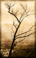
Old Treeby fitz3000Comment by bassbone: A nice photo...did you use a texture layer in this shot? I would love to know what camera settings you used to capture this. |
| 05/06/2009 03:10:31 AM |
Old Treeby fitz3000Comment by litreofcola: is that a texture layer edit?? i was under the impression they wernt allowed in challenges, love the look and was wondering to put them in the darkness challenge.. let me know if you dont mind. cheers |
Home -
Challenges -
Community -
League -
Photos -
Cameras -
Lenses -
Learn -
Help -
Terms of Use -
Privacy -
Top ^
DPChallenge, and website content and design, Copyright © 2001-2026 Challenging Technologies, LLC.
All digital photo copyrights belong to the photographers and may not be used without permission.
Current Server Time: 06/21/2026 07:13:27 AM EDT.