| Image |
Comment |
| 07/14/2010 08:17:14 AM |
|
 Photographer found comment helpful. Photographer found comment helpful. |
| 09/13/2009 07:54:21 PM |
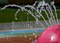
Liquid Linesby FromDaRockComment by Yo_Spiff: I gave this a 5. I saw a good effort to capture an interesting shot, but the image is a little flat. The background appears tilted, and distracts from the main subject. I think it has some potential though, and I did a quick edit to see what I could pull from it. I think by fixing the tilt and cropping, the background was reduced as a distracting element, and might even be a secondary point of interest. I kind of like the way it looks like colorful strata.
 |
| Photographer found comment helpful. |
| 09/13/2009 07:40:47 PM |
Liquid Linesby FromDaRockComment by David Ey: Well Robin, you have pretty much answered your own question. Looks like a shoehorn entry and has a poor choice of background. The rotation didn't help. The water spirts don't screem "lines", and without the title who'd a guessed.
In your favor though, the pink thing is focused well and the water does make a nice interesting subject, for the one taking the shot and trying to stop the motion, which you did.
I didn't vote but if I had it would have been a 5. Depending on my mood it might have been 4, (probably a 5). Everybody has their own scale but I find it hard to see a 1 or 2 here as well as an 8, 9, or 10.
"Not actually taken for the challenge" says a lot.
Good luck in future challenges and keep on entering...David |
| Photographer found comment helpful. |
| 09/09/2009 08:43:27 AM |
Liquid Linesby FromDaRockComment by FromDaRock: Originally posted by InnaN:
Great capture! The background is a bit busy and could use rotating. |
I agree. Not much I could do in this location though. I would have tried something different if I was actually trying to take a shot for the challenge. Just wanted to finally put in a second entry.
This one was already cropped and rotated to get rid of some worse distractions. I had a similar one with much better content, but it was just not near as sharp. Would have scored much better if the shot was technically as good as this one. |
| 09/02/2009 10:12:07 PM |
|
| Photographer found comment helpful. |
| 04/22/2009 10:50:05 PM |
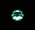
Solitaireby FromDaRockComment by FromDaRock: Originally posted by surlybiff:
Nice. Even though I think you could have cropped in a lot closer, I'm giving you points for such a great use of light here. 100% on topic. Nice one. |
Thanks. I tried cropping it closer, but I didn't like it for two reasons:
1) Didn't have the same 'effect' without being surrounded by as much black.
2) Zooming in so much brought out too many flaws in the 'stone', which is actually a child's toy with a gem like plastic piece attached to a light. |
| 04/22/2009 10:46:43 PM |
Solitaireby FromDaRockComment by FromDaRock: Originally posted by Teafran:
Different use of light and creative in every respect. Nicely lighted, the white are right on the edge which is a positive from a technical standpoint. From an artistic standpoint, it suffers from a loss of facet detail, but that is countered by the very interesting effect of the gentle curves of the light source itself. The top light bloom is distracting by being ever so slightly over done. A good solid demonstration of the creative use of lighting on the subject and a clever idea both from the technical and artistic aspects. Should place well in the challenge. |
Thanks for the comments. The lack of facet detail is less about the photography and more about the fact that it is a child's toy without good clean lines between the facets :)
I wish you were right about my placement in the challenge too :(
lol, but I am happy to have finally submitted none the less. |
| 04/22/2009 10:42:06 PM |
Solitaireby FromDaRockComment by FromDaRock: Well, it was a rushed last minute entry, but I finally got around to entering a challenge. Didn't expect much score wise, but it felt good to finally submit instead of just look and vote. |
| 04/20/2009 11:55:27 AM |
Solitaireby FromDaRockComment by Teafran: Different use of light and creative in every respect. Nicely lighted, the white are right on the edge which is a positive from a technical standpoint. From an artistic standpoint, it suffers from a loss of facet detail, but that is countered by the very interesting effect of the gentle curves of the light source itself. The top light bloom is distracting by being ever so slightly over done. A good solid demonstration of the creative use of lighting on the subject and a clever idea both from the technical and artistic aspects. Should place well in the challenge. |
| Photographer found comment helpful. |
| 04/16/2009 12:19:01 AM |
Solitaireby FromDaRockComment by surlybiff: Nice. Even though I think you could have cropped in a lot closer, I'm giving you points for such a great use of light here. 100% on topic. Nice one. |
| Photographer found comment helpful. |
Home -
Challenges -
Community -
League -
Photos -
Cameras -
Lenses -
Learn -
Help -
Terms of Use -
Privacy -
Top ^
DPChallenge, and website content and design, Copyright © 2001-2026 Challenging Technologies, LLC.
All digital photo copyrights belong to the photographers and may not be used without permission.
Current Server Time: 06/23/2026 10:06:57 PM EDT.