| Image |
Comment |
| 11/28/2003 11:42:32 PM |
|
| 11/28/2003 06:14:50 PM |
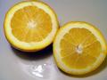
The Scent of an Orangeby tragicharpyComment by Neil: Good shot; lighting is a bit harsh, and I think it would have been better without the reflection of the lights at the bottom. Actually, a nice black, velvet background would have really brought out the orange color. Which by the way, it might be my laptop, but it looks a tad yellow rather than orange: when I first looked at it I thought it was a lemon. |
| 11/27/2003 08:33:59 AM |
The Scent of an Orangeby tragicharpyComment by Kavey: Smell, yes. Image with visual interest, not overly.
Background doesn't add anything and harsh reflection of light in the liquid on the grey surface seems to attract my eye more than the oranges themselves.
|
| 11/27/2003 01:43:28 AM |
|
| 11/26/2003 05:07:45 PM |
|
| 11/26/2003 12:39:57 PM |
|
| 11/26/2003 12:00:43 PM |
|
 Photographer found comment helpful. Photographer found comment helpful. |
| 09/22/2003 02:02:41 AM |
|
| 09/21/2003 06:13:07 PM |
|
| 09/20/2003 05:59:48 PM |
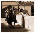
A Different Type of Sportby tragicharpyComment by faidoi: Ye olde sports. Great theme and composition. I like how you captured the shadow on the left side of the picture and the light on the right. Kind of gives it the dark knight vs. the good knight. Very yinyang-ish.
The angle helps with the composition. It brings your eyes toward the center with the help of the pertition in the middle.
I like the sephia, but it would be interesting to see this in color also. Usually the knights are wearing really beautiful bright colors. |
| Photographer found comment helpful. |
Home -
Challenges -
Community -
League -
Photos -
Cameras -
Lenses -
Learn -
Help -
Terms of Use -
Privacy -
Top ^
DPChallenge, and website content and design, Copyright © 2001-2026 Challenging Technologies, LLC.
All digital photo copyrights belong to the photographers and may not be used without permission.
Current Server Time: 07/16/2026 10:41:39 PM EDT.