| Image |
Comment |
| 04/28/2005 10:02:12 AM |
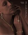
The Links Collectionby EddyGComment by glad2badad: Nice job duplicating the feel of a Jewelry Advertisement. Good pop with the jewelry pieces...they stand out nicely. Nice use of lighting to get this effect. I'm thinking this will make top 10. Good luck. |
 Photographer found comment helpful. Photographer found comment helpful. |
| 04/28/2005 09:01:03 AM |
The Links Collectionby EddyGComment by fplouffe: Very good use of post precessing to make the jewelry stand out of the model. Text is not too intrusive also, very good. My only quirk is personal, but your model seems to be in pain, likes she don't enjoy wearing the jewels (an impression not good in a jewel ad). A very gentle smile would have make this picture top rated. 6 |
| Photographer found comment helpful. |
| 04/28/2005 08:12:14 AM |
The Links Collectionby EddyGComment by geewhy: Could definitely see this in a magazine or jeweller`s window.
The lighting and colour tone is perfect for contrasting with the gold.
The very professional look this image has should guarantee a good placing....best of luck. |
| Photographer found comment helpful. |
| 04/27/2005 03:08:15 PM |
|
| Photographer found comment helpful. |
| 04/27/2005 02:31:39 AM |
The Links Collectionby EddyGComment by Sammie: This is great - it looks just like a magazine ad for jewelry! I really like how the gold and diamonds stand out. |
| Photographer found comment helpful. |
| 04/26/2005 09:12:25 PM |
|
| Photographer found comment helpful. |
| 04/26/2005 08:23:21 PM |
The Links Collectionby EddyGComment by bcoble: One of the better photo's I have seen so far. I like how you brought out just the jewery. I like the expression on the model. I do not care for the font however to me that does not count. |
| Photographer found comment helpful. |
| 04/26/2005 06:19:50 PM |
The Links Collectionby EddyGComment by neophyte: This is the type of layout I look for! Creative and refined. The pieces really stand out as does the font! I only would recommend a larger font Up top and that the photo be from a different angle to avoid the overlapping earring and necklace. The bottom text is what we refer to as "a call to action" and is not in many of the entries. Outstanding work. |
| Photographer found comment helpful. |
| 04/26/2005 05:12:43 PM |
|
| Photographer found comment helpful. |
| 04/26/2005 03:14:45 PM |
|
| Photographer found comment helpful. |
Home -
Challenges -
Community -
League -
Photos -
Cameras -
Lenses -
Learn -
Help -
Terms of Use -
Privacy -
Top ^
DPChallenge, and website content and design, Copyright © 2001-2026 Challenging Technologies, LLC.
All digital photo copyrights belong to the photographers and may not be used without permission.
Current Server Time: 06/25/2026 12:50:48 AM EDT.