| Image |
Comment |
| 04/29/2005 09:09:18 AM |
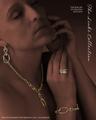
The Links Collectionby EddyGComment by shareinnc: Very nice composition, though the rings might be better left out to showcase the lovely braclet, earring and necklace set. |
 Photographer found comment helpful. Photographer found comment helpful. |
| 04/29/2005 06:56:59 AM |
The Links Collectionby EddyGComment by SnapperL: I like the softning of saturation on the woman. It really does bring out the color of the jewelery. Very niceley done. 10 |
| Photographer found comment helpful. |
| 04/29/2005 01:00:43 AM |
The Links Collectionby EddyGComment by awpollard: Very nice shot, I give it high marks. Personally I think with the excellent toning that you did to background/secondary subject here that the shot may have had even more impact with maybe just the ring or the ring and the necklace. Great shot, excellent post processing but for me just feels like too much bling bling to look at. Still one of my tops. Fonts are fine, still undecided about the vertical text. |
| Photographer found comment helpful. |
| 04/29/2005 12:26:42 AM |
|
| Photographer found comment helpful. |
| 04/29/2005 12:20:32 AM |
The Links Collectionby EddyGComment by itsrazzi: Very good and very professional. Colours, angle, text, everything. Only thing I'd suggest is to make the woman and background a little darker so the jewelry sticks out more. |
| Photographer found comment helpful. |
| 04/28/2005 11:04:53 PM |
The Links Collectionby EddyGComment by RedOak: Cool concept! I really like the shades of the skin vs the jewels. They seem to be missing some sharpness unfortunatly. Text is cool and looks good, not in the way too much. I seem to think you selected the jewels out of the pic for better editing... 6 |
| Photographer found comment helpful. |
| 04/28/2005 06:46:31 PM |
The Links Collectionby EddyGComment by Montereykiddo: It may be this monitor cause I'm at work, but her skin tone looks really really odd. I'm sure you darkened her in post to bring out the jewelry and make it pop, but something more needs to be done with her skin and i can't put my finger on it. I love the picture as a whole. Nice model, idea, and composition. Right on with the fouc too. Nice work!
Happy shooting,
Chris A |
| Photographer found comment helpful. |
| 04/28/2005 03:27:07 PM |
|
| Photographer found comment helpful. |
| 04/28/2005 01:00:13 PM |
|
| Photographer found comment helpful. |
| 04/28/2005 10:22:26 AM |
The Links Collectionby EddyGComment by alternarule: Well done, like how the jewelry really pops off of the body. Good work at toning out the person and making her drop to the background. However the jewelry could use a big more pop and brightness. |
| Photographer found comment helpful. |
Home -
Challenges -
Community -
League -
Photos -
Cameras -
Lenses -
Learn -
Help -
Terms of Use -
Privacy -
Top ^
DPChallenge, and website content and design, Copyright © 2001-2026 Challenging Technologies, LLC.
All digital photo copyrights belong to the photographers and may not be used without permission.
Current Server Time: 06/25/2026 12:50:42 AM EDT.