| Image |
Comment |
| 09/21/2002 12:19:00 PM |
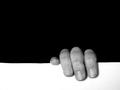
Hangin' Onby karmatComment by Kavey: I like this simple image a lot. It's a great rule of thirds example and yet still original and punchy. 7, Kavey |
 Photographer found comment helpful. Photographer found comment helpful. |
| 09/20/2002 02:40:00 PM |
|
| Photographer found comment helpful. |
| 09/20/2002 12:34:00 PM |
|
| Photographer found comment helpful. |
| 09/20/2002 06:57:00 AM |
Hangin' Onby karmatComment by hypoStiller: To me, this photo poses a friendly debate over which of the spaces is the negative space. It's the debate that keeps me interested, after the initial grin at this poor soul clinging to the edge. I would have preferred a perfectly even white area (the line is a tiny bit crooked), but the general composition is right on. Good lighting (maybe a bit more contrast?) and good use of negative space up top ... it weighs down on top of the fingers. 8 |
| Photographer found comment helpful. |
| 09/19/2002 11:27:00 PM |
|
| Photographer found comment helpful. |
| 09/19/2002 09:15:00 PM |
Hangin' Onby karmatComment by Jacko: Very original. I like the composition. ... makes you wonder what is behind the person hanging on. 8 |
| Photographer found comment helpful. |
| 09/19/2002 02:01:00 PM |
Hangin' Onby karmatComment by jmsetzler: Interesting :) This is definitely a unique interpretation of the challenge... The focus on the fingers is a tad soft for my taste, and the flash appears to have washed out some of the finer detail in the fingers. Meets Challenge: 10 Technical Merit: 4 Artistic Merit: 5 Creative Merit: 7 WOW Factor: 5 Score: 6 - JMSetzler |
| Photographer found comment helpful. |
| 09/19/2002 10:48:00 AM |
|
| Photographer found comment helpful. |
| 09/19/2002 10:21:00 AM |
Hangin' Onby karmatComment by Froober: What can i say??? I love this..awesome clean lines...contrast...use of negative space...great idea! Lisa |
| Photographer found comment helpful. |
| 09/19/2002 09:58:00 AM |
Hangin' Onby karmatComment by DigiPique: Very clever - really jumps out at you! I wish there was no thin grey line around our photos when they are displayed for us to judge - yours would otherwise be even more powerful, I think! - not your fault, I know! :) I do like the use of neg space here - a good example of where a single color is more effective in a negative space than a texture or other treatment. |
| Photographer found comment helpful. |
Home -
Challenges -
Community -
League -
Photos -
Cameras -
Lenses -
Learn -
Help -
Terms of Use -
Privacy -
Top ^
DPChallenge, and website content and design, Copyright © 2001-2026 Challenging Technologies, LLC.
All digital photo copyrights belong to the photographers and may not be used without permission.
Current Server Time: 06/19/2026 04:16:26 PM EDT.